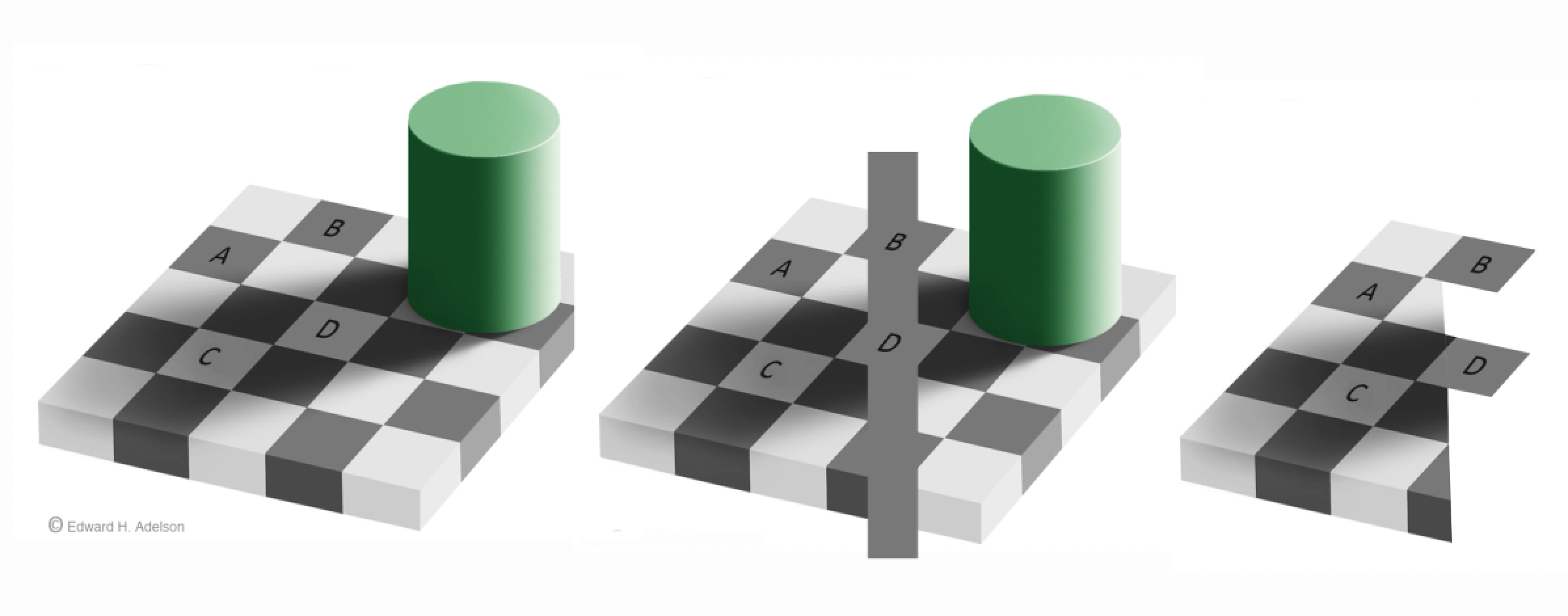
Here’s a picture to announce a summer posting pause. We’re working hard on brilliant new features, for a relaunch in a few weeks. But meanwhile explore the archive – there’s stacks on the site now, and it’s almost all new stuff, not the versions you see on lots of illusion sites. Try putting the name of any illusion that interests you into the search box at the bottom of the lists to the right. Or explore popular categories, like Impossible Worlds. And don’t forget (if you’ve been here before) that there are now nearly a hundred brilliant mini illusions for you to download for your own sites.
This picture is a Photoshop fantasy rather an illusion, but it’s here because I like bubbles. I think the creature is a gecko, (please comment if I got that wrong). The background and sky is from the Nile in Egypt, but I snapped the gecko in the London Zoo. There’s an earlier post on how I photograph the bubbles. For all the bubble picture posts (and some nice ice) see the category Soap Bubble Pictures.
Just about our first post was a tessellation tutorial. It was quite comprehensive, but a bit heavy going. I’ve been wanting to post an animated demo, because I reckon that seeing that first would make the tutorial much easier to follow. So the animation is below, but first, a reminder of the basics:
A tessellation is a pattern like the one above. The cells of the pattern fit together like jig-saw pieces, with no gaps and no overlaps. You can’t make a pattern like that out of just any old shape. It only works with shapes whose edges can be snipped into pairs of segments with special properties. The two segments in each pair must be indentical, except that they may be either reflections of one another, or rotated in relation to one another, like the hands of an old-fashioned clock. Confused already? Just watch this animation, showing the evolution of the pattern above, and you’ll see how it all works.
If you can see this illusion, you may be amazed to discover it’s not an animation. Most people will see waving movement, yet the pattern of lozenges is not really moving at all. But about 5% of people just don’t see this kind of illusion, and if that’s you, it doesn’t mean anything’s wrong. If you do see the movement, it won’t be wherever in the pattern you focus, but in the periphery of your field of view. However, the effect is also very sensitive to size. I see it vividly with the screen about 15 inches (36 cms) from my eyes, and the image 8 inches (21.5 cms) wide on the screen, but I think you’ll get an even better effect by clicking on the image, if a bigger version then comes up on your system.
It’s a kind of illusion only discovered in the last few years. Lots of discoveries about it have been made by Japanese researcher Akiyoshi Kitaoka, and on his site (amongst scores of other stunning illusions) you’ll find his masterpiece in this line, his famous rotating snakes illusion.
I’m fascinated by the Poggendorff illusion, and this is a new version of it. (Well, it is according to me. Others would say it’s a different illusion). I’ve prepared it as an image that can be seen in 3D without a viewer, just to make it more vivid, but you don’t have to view it in 3D to see the effect. (If you do want to view it in 3D, but don’t have the knack, visit this tutorial).
To see what it’s all about, first check out the figure below:
To the left is the classic Poggendorff figure: the oblique lines are objectively aligned, but the left hand one appears shifted downwards. About forty years ago, researcher Stanley Coren showed that the effect persists, weakly, when the configuration is reduced to dots, as to the right. But now look at the little array of spheres below. This is a new kind of dot (or sphere) Poggendorff illusion. Imagine a line drawn through the two spheres to the right. Now imagine a line running from the mid point between them, at right angles to the line joining them, like an invisible axis running through the gap between them. To my eye, it looks as though that axis would pass just above the single sphere to the left, but objectively the target sphere is right in line with it. So that left hand target sphere is apparently shifted downwards, just like the left hand oblique test line in the traditional, blue figures.
Now try viewing the array at the start of the post. It’s just a multiple version of the array of spheres in the second figure. Check out just the three yellow spheres top right, for example. So the position shifts we see here are like the ones we see in classic Poggendorff figures, but none of the explanations advanced for the misalignment seen in the Poggendorff illusion, including Stanley Coren’s dot version, can easily be applied to these new figures.
This is a variant on one of the famous demonstrations devised by USA born Adelbert Ames II, the Ames Window. Watch the name Adelbert rotate, and it just goes around clockwise. So does its shadow. But then watch the name Ames II rotate. At a certain point, it changes direction, and starts to rotate anti-clockwise. At that point, I find I can see the shadow of Ames II go around either way.
The change in direction appears because what’s rotating is not the name Ames II as it would usually appear on a page, but a perspective view of it. It’s receding into the distance with the A end nearer to us, and large, and the II end further away, and smaller. But that means that as the name rotates, at a certain point the smaller end starts to get nearer to us, and the larger end further away. That’s so contrary to anything that ever happens in everyday vision that our brains won’t accept it. The instant the smaller end of the name tries to swing past the point at which it would be nearer to us than than the large end, the rotation appears to reverse. The reversal looks a bit odd, but that’s a price our brains seem happy to pay, if it keeps the large and small ends of the name looking like they’re where they should be.
If my attention is on the Ames II bit of the image, in my periphery strange things also start to happen to the Adelbert bit. When Ames II changes direction it seems to pull Adelbert around with it. That’s OK for the first quarter turn, when the letters of Adelbert are seen as if from the back. But once they swing round to a front view, there’s a conflict and I’m not quite sure which way it’s turning.
The demo is just about the opposite of the earlier post with the figure of Mercury rotating. In that demo, the rotation of the silhouette is ambiguous. There’s nothing ambiguous about the Ames demo: the lettering enforces one direction of rotation at any point, even if the result requires an about turn.
There’s a brilliant online demo of the window version with a commentary , and also with a visually baffling added feature, by psychologist Richard Gregory.
Here are three rather subtle illusions, each showing bent lines. In Bourdon’s illusion, to the left, the straight left hand edge looks bent. In Humphrey’s figure, centre, the straight, loose line touching the corner of the cube looks bent. And in the figure to the right, the straight line interrupted by the corner looks bent. I don’t think we really understand any of these illusions, and they are not very dramatic, so you don’t see them often. When someone does puzzle them out, for sure they’ll be a key to subtle ways the brain works. There’s probably a different explanation for each. For example, both the left and middle figures show a bent line that is the backbone of two triangles meeting at a point, so you might think, hello hello, we’re getting somewhere. But then you notice that the lines bend in different directions in relation to the triangles each illusion.
If you like to tangle with the technicalities, there are learned studies of the Bourdon illusion and the corner figure, though unfortunately, you’ll only get an abstract of the articles on those links, unless you are in a university library where they subscribe to the journals. And you won’t find much on Humphrey’s figure anyway, it’s seriously obscure.
In earlier posts we showed perceptual puzzles in some works of art. Artists, and poets and composers, often seem to use these puzzles, especially ambiguity. (There’s more in Illusions and Aesthetics in the category bar to the right). Here’s another strategy: to have a design that’s so complicated that the shapes of anything you might recognise within it are hidden, as if by camouflage. This is an example in carving from an eight hundred year old Norwegian Church doorway. There are fabulous creatures here, but you’ve got to look hard for them. Here’s a demo to reveal a bird I reckon I can puzzle out. The body’s in the middle, with a wing above it to the left, and two claws hanging down,and then there’s a seriously long serpentine neck, weaving in and out of the plant stems:
These photos are from a nineteenth century plaster cast in the Victoria and Albert Museum in London. I’m don’t know if the original church survives, or where in Norway it was. If anyone knows, please comment.
Interlace camouflage like this was very common in Christian art from fifteen to seven hundred years ago. Check out the fabulous Irish Book of Kells. In islamic art representation of creatures was usually not accepted, but arabic inscriptions are often camouflaged in the same way. The inscriptions in the famous Alhambra in Granada, Spain are so camouflaged they’ve only just been deciphered. (That’s a news link, at 11/5/09, so I’m not sure how long it be live).
This is a stereo picture-pair, but you can see what’s happening here without having to view the images in 3D if you prefer. However, if you’ve not got the knack, and would like to practice on this post, here’s how. Hold up a pen about in the middle, between the two pictures, and about five inches from your eyes (careful!). If you now try to focus on the tip of the pen, you’ll notice that the blurry image of the figure has doubled. Now move the pen-tip away from your eyes, and notice that the two blurry middle images of the figure are beginning to overlap. Once they overlap (probably when the pen-tip is something like ten inches away from your face), see if you can get them to overlap exactly, and then come into focus. If that doesn’t work, try this great tutorial on another site. Or try our earlier post about stereo picture pairs.
If you’ve got it, you should see the parallel vertical bars and their attachments floating in front of a surface with their shadows thrown on it. You’ll see the same if you view the image normally, but not with the illusion of 3D. So what’s going on?
It’s a much stronger version of some paradoxical effects I showed in an earlier post. The tips of the arrowheads are all objectively exactly the same distance apart, as indicated by the horizontal lines aligned with them in between the vertical bars. But that’s not how they appear if you look at the arrowheads: the inward pointing arrows look much further apart than the outward pointing ones. (That’s the Mueller-Lyer illusion). But now check out the lower, coloured arrowheads. The coloured arms that contact the vertical bars are objectively aligned, but appear not to be – the upper arm in each case seems shifted a bit upward, and the lower arm a bit downward. (That’s the Poggendorff illusion). For the arms to appear out of alignment like that, you’d imagine the arrowheads must move further apart. But that’s exactly the opposite of what the Mueller-Lyer illusion is making them seem to do.
Here’s another ambiguous severed head illusion. Is Koala thoughtfully holding up the severed head of Woven Person for inspection, or is it the other way round? You can see it both ways. For examples of this illusion in earlier posts, check out The Screams after Munch, the Monks, and the Mask/Skull illusion. (On that link this illusion may be at the top of the page, if so scroll down for the previous versions).
Like our bubble pictures this is not really an illusion, but I am fascinated by natural shapes. It’s a picture of blades of ice, and what you see here is about three inches across. The colours come from taking the picture in polarised light, as the crystal blades were forming in a shallow dish of water in a freezer.
Want to try your own pictures? The preparations are not trivial, but there’s nothing a school science section couldn’t handle.