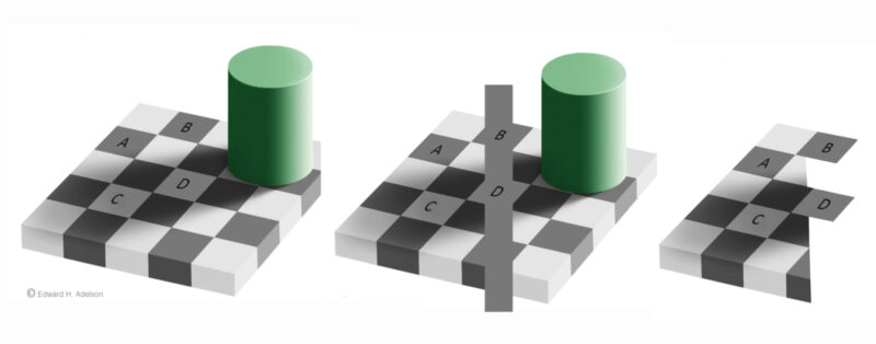
 On the left is Edward Adelson’s famous Checker Shadow Illusion, published in 1995. Square B looks much darker than D. However they are actually the same uniform grey, as can be seen by comparison with the bar overlaying them in the middle image.
What’s going on? The brain has strategies for keeping the relationships between the tones and colours of objects in a scene – for example between the light and dark rectangles here – consistent, in spite of big variations in illumination in different parts of the scene. The shadow of the cylinder gives the variation in illumination in this scene.
That makes the middle picture visually paradoxical. C looks much lighter than A, and yet we can see that it is the same tone as D and the overlaying grey bar, and therefore B as well. But B looks the same tone as A, even though A looks, paradoxically, darker than C.
To my eye, the paradox is even more mysterious in the right hand version. At first glance, A, B, C and D all look to me the same tone – and yet if I concentrate just on A and C, C tends still to look lighter.
The key is that Adelson’s illusion only works when we see objects as part of a three-dimensional scene, complete with illumination. The introduction of the grey bar in the middle image breaks the spell, for the squares it overlays. In the right hand image, the left hand side looks three dimensional, and shows the illusion. But the two squares sticking out to the right no longer seem so much a part of the scene, and we see them in their true colours. It is remarkable that there can be such variations in appearance in different parts of the visual field, and from moment to moment with shifts in attention.
For Adelson’s own, more technical (and authoritative) explanation, go to:
https://bcs.mit.edu/directory/edward-adelson and click on Research
