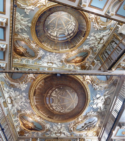
You’re going to have to hurry, but if you can get to the Royal Cornwall Museum in Truro, England, before July 3rd, you can see this brilliant sculpture of a dog by British sculptor David Kemp, in his exhibition The Botallack Hoard. It’s one of the dogs in his piece The Hounds of Geevor, and if you don’t make the show, you can see them anytime in bronze in the centre of the nearby town of Redruth. Truro and Redruth are in Cornwall, which if you look at a map of England is the pointy bit in the bottom left hand corner. David lives pretty much as far down the bottom corner as you can go, and I think he’s one of the very best sculptors anywhere working, amongst other interests, on ambiguous images, on which I’ve posted several times before. He works with every kind of what some people might call junk, but he discovers in it ideas that I find very funny and very beautiful. If you’d like more information on David Kemp, see his brilliant website.
Here’s another of David’s sculptures, of three musicians, along with more detail of one of them.
This is a detail from British artist William Hogarth‘s print made in 1754, to demonstrate mistakes in perspective. For example, the sheep lower left get larger with distance, not smaller, and the woman top right is leaning out of a window offering a light to a man in the distance.
However I’m really showing it because a brilliant new animated demo of perspective anomaly, by Kouchiki Sugihara, has just won the first prize in the international Best Illusion of the Year Contest. Don’t miss it, the ten best entries are shown, and there is some brilliant new stuff.
Coming back to Hogarth, his print was way before its time. It was over a hundred years later, late in the nineteenth century, that illusion and puzzle picture books became common. Then artists took up the challenge, Magritte and Escher for example.
You’re welcome to download and use for private purposes any of the imagery on the site, except for a very few pictures where I indicate that third party copyright might apply. But if you’d like a giant, 35 x 23 inch poster, full of illusions, you can buy it (along with loads of illusions on bags, T-shirts etc.) from www.Cafepress.co.uk/optoct. I was delighted when I saw the quality of the poster. Each of the illusions is identified with a discreet caption line, so that you’d be able to follow them up on this or other sites. And of course, lots of these illusions are brand new versions, often with an extra twist of some kind.
Illusions make brilliant gifts.
You’ll also find a poster of the whole of my optical illusion cartoon story. If you’d like to preview that, read on.
This is one of the oldest ambiguous images I know. It’s a small clay mask from Mesapotamia, (in modern day Iraq), made about 3750 years ago. It’s the face of the giant Humbaba, but as he might have appeared to a soothsayer, looking into the writhing entrails of a sacrificed animal for purposes of divination. If the face of Humbaba appeared in the entrails, in the way we sometimes see a face in clouds, it was a sign of revolution on the way. This evocation of the experience is in the British Museum, and they have a web page about it. (They even know the soothsayer who made it …).
I’ve written in earlier posts about the way that artists often seem to use perceptual puzzles as a starting point for aesthetic and emotional effects in artworks. This is a particularly fascinating example. It’s a work of art, but it’s also a record of emotional effect arising out of a perceptual puzzle, an ambiguous image, in a quite different kind of activity – divination. If I’ve got it right, quite a lot of fortune telling starts with ambiguous visual discoveries like this, when peering into tea-leaves, or crystal balls. I wonder how deep the common roots of aesthetics and shamanistic experiences go.
One route you can trace is through the entrails. You can’t quite be sure in this image, but when you look at the real thing, so you can look round the edges, the face is made up of one continuous entrail, coiling to and fro. If you can get to the British Museum, it’s in a case in their new Mesapotamia gallery, but you may have to hunt around, it’s not big.
This wonderful ornamental canoe prow represents some fabulous creature, looking to the right. Prows like this appeared on boats used in a cycle of trade around the Trobriand and nearby Islands in the Western Pacific, called the Kula trade. The wonderfully ornamented canoes were only a small part of the story of this cycle of trading, but an intriguing one: the idea was to contrive a canoe so visually baffling that as your fleet of canoes approached the beach, it left your trading partners too bemused to compete in bartering. (For a more detailed account, if you fancy a bit of fairly heavyweight anthropology, there’s a fascinating essay by Alfred Gell called The Technology of Enchantment, in a book on art and anthropology from 1992).
The canoe prow is in the museum in Liverpool, UK, but to see a whole canoe go to the museum in Adelaide, Australia. It doesn’t have quite such a splendid, baffling prow, but it does show what these fabulous boats were like.
If you’d like to know out why these canoe prows remind me of paper marbling, read on.
Just about our first post was a tessellation tutorial. It was quite comprehensive, but a bit heavy going. I’ve been wanting to post an animated demo, because I reckon that seeing that first would make the tutorial much easier to follow. So the animation is below, but first, a reminder of the basics:
A tessellation is a pattern like the one above. The cells of the pattern fit together like jig-saw pieces, with no gaps and no overlaps. You can’t make a pattern like that out of just any old shape. It only works with shapes whose edges can be snipped into pairs of segments with special properties. The two segments in each pair must be indentical, except that they may be either reflections of one another, or rotated in relation to one another, like the hands of an old-fashioned clock. Confused already? Just watch this animation, showing the evolution of the pattern above, and you’ll see how it all works.
In earlier posts we showed perceptual puzzles in some works of art. Artists, and poets and composers, often seem to use these puzzles, especially ambiguity. (There’s more in Illusions and Aesthetics in the category bar to the right). Here’s another strategy: to have a design that’s so complicated that the shapes of anything you might recognise within it are hidden, as if by camouflage. This is an example in carving from an eight hundred year old Norwegian Church doorway. There are fabulous creatures here, but you’ve got to look hard for them. Here’s a demo to reveal a bird I reckon I can puzzle out. The body’s in the middle, with a wing above it to the left, and two claws hanging down,and then there’s a seriously long serpentine neck, weaving in and out of the plant stems:
These photos are from a nineteenth century plaster cast in the Victoria and Albert Museum in London. I’m don’t know if the original church survives, or where in Norway it was. If anyone knows, please comment.
Interlace camouflage like this was very common in Christian art from fifteen to seven hundred years ago. Check out the fabulous Irish Book of Kells. In islamic art representation of creatures was usually not accepted, but arabic inscriptions are often camouflaged in the same way. The inscriptions in the famous Alhambra in Granada, Spain are so camouflaged they’ve only just been deciphered. (That’s a news link, at 11/5/09, so I’m not sure how long it be live).
You probably know the tiling patterns of M.C.Escher. But how about Koloman Moser? Here are a couple of his designs.
Moser was working in Vienna, Austria, a hundred years ago. (He died in 1918). I don’t know where he would have learned to do tessellating designs, that is, designs with motifs that repeat the way jigsaw puzzle pieces fit together, with no gaps or overlaps. If you have checked out our tessellation tutorial, you’ll know that the secret of these designs is that the edge of each “tile” of the pattern must be able to be snipped into pairs of identical line segments. Here’s how it works with Moser’s fish design.
To the right you can see that the fish outline can be divided into three pairs of segments, a yellow pair, a red pair and a blue pair. In the yellow pair, the top line is just repeated lower down to make the pair, in a move called a translation. The red and blue pairs are a bit more complicated. In each pair, the lower line segment is a mirror reflection of the upper segment, but shifted downwards. That kind of shifted reflection is called a glide reflection. It’s a fact that any motif whose edges can be snipped into one pair of segments that repeat by translation, connected as here to two parallel pairs whose edges repeat by glide reflection, will tessellate perfectly. And that’s just one of 28 recipes for motifs that tessellate.
The second Moser design is based on exactly the same recipe, but it’s more complicated. In fact, it’s fiendish …..
Here’s another example of the way illusion effects have been used in decorative art designs. (For examples in earlier posts, check out the category Illusions and Aesthetics, to the right). This mosaic is one of many from the Villa Romana del Casale, in the middle of Sicily, Southern Italy. Only the floors of this Roman villa are left. They are about 1700 years old, and are the largest expanses of mosaic floor surviving from the ancient classical mediterranean world.
The illusion comes in because different shapes in the design tend to pop out from one moment to the next. For example, in the pictures below I’ve selected out a star and a string of lozenges in the picture on the left, and then a hexagon shape in the picture on the right. Note that the hexagon interlocks with the star beside it with no gaps between them or overlaps, but when we select one, the other kind of vanishes, not only in these demo pictures, but even in the big picture at the start of the post. It’s a figure/ground effect, as in the faces/vase illusion, but without the dramatic light/dark contrast of faces and vase.
It wouldn’t be easy to find two more different artefacts than these. On the left is a silk velvet embroidery made in Italy about five hundred and fifty years ago. On the right is a shield from Koave in Papua New Guinea, made in the last hundred years. Yet they both use exactly the same graphic device, a figure/ground effect.