Category Archives: Ambiguous images

An ambiguous heads Indian mural

Photos © Michaela Butter

The elephant and the horse share an eye!  You can see the eye as belonging either to the elephant and its trunk, or to the head of the horse caught between the elephant’s tusks. It’s an optical illusion of a kind unusual in Indian painting.  It was brilliantly spotted by my friends Michaela and Eddy Keon, visiting the palace in the beautiful, not so well known Rajasthani hill town, of Bundi.

The painting is in a style developed by the unknown artists who decorated the palace at Bundi with glorious murals in the seventeenth century.  Bundi painting is one of a number of local styles of Rajasthani painting, developed, mostly by artists decorating palaces, separately from the better known contemporary Mughal styles.

A Funny Turn

It may take a bit of practice, but you’ll be able to see the silhouette dinosaur rotating either way around.  One way round, it’s  rotating just like the top right hand of the four coloured dinos.  To see it rotate the other way round, start with the head facing left.  Then try imagining that the head is getting nearer to you as it goes lower.  Once you’ve seen the rotation go both ways, it tends to change spontaneously from one to the other.

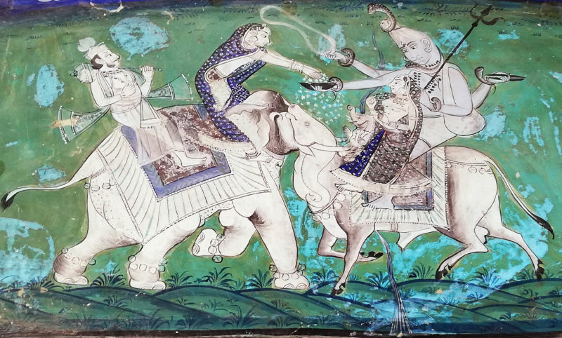
I’m not great at imagining 3D shapes moving in space. When I set this up, I assumed that when the silhouette rotates the way around that doesn’t match the top right hand coloured dinosaur, it  will instead match one of the two left hand dinos, but half a rotation out of step.  The top left one is just a mirror reflection of the top right coloured one, and the lower left one a time-reversed version of it.  But I wasn’t sure which of the those left hand dinos it would match.  (The lower right coloured dino is a reflection plus a time-reversal of the top right one.  That switches the rotation twice – back to matching the way around the top right dino goes).

But the silhouette dino, when seen as rotating opposed to the top right dino, isn’t like either of the left hand versions!  In those, the head is always nearest to us when it’s at its highest, and furthest from us when it is lower down.  With the silhouette view clockwise, it’s the other way round:  the head is nearest to us when its low down.  I think it’s an impossible view, invented by the brain.  There’s no way I can get the real dino to give me that view.  (Actually – full disclosure – I didn’t film a real dinosaur.  It’s a model).

I haven’t quite puzzled out why the views work like this.

Extra:  18/2/20

I found the explanation in a chapter in the wonderful Oxford Compendium of Visual Illusions,  Nicolaus F. Troye “The Kayahara silhouette illusion” pp 582-585.

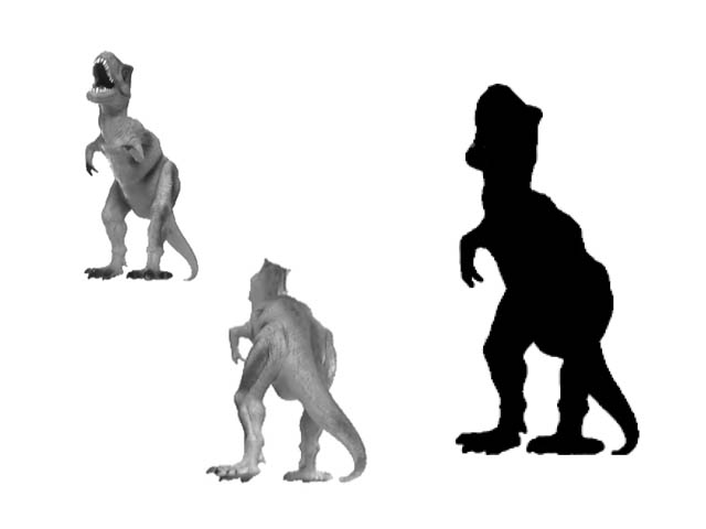
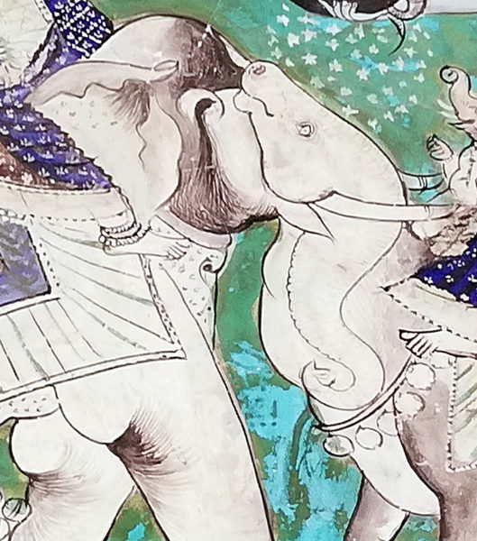
The key is that the sihouette version image is not just rotationally ambiguous (it rotates clockwise or anti-clockwise), even as a static image it’s also depth ambiguous.  So the silhouette above can either appear just like the upper left dino in the picture, head nearest to us, or a bit like the lower centre dino, head furthest away.  Both ambiguities – rotation and depth – can only flip at the same time.

But note that the silhouette and the picture of the dino with head more distant are not quite the same.  That’s because the dino extends so far into depth that it shows perspective effects.  First, with reversal our viewpoint slightly changs.  But more strikingly, when we see the silhouette dino with its head furthest from us, the head looks far too large.  That’s because of the size constancy effect – we tend perceptually to enlarge the size of more distant objects.  So here, when the head is seen as more distant, it also appears far too large, and the tail, conversely, too small.

That also applies with the moving version, when the silhouette dino is seen as revolving anti-clockwise:  its head seems to shrink as it rotates towards us, and to expand as it rotates away.


The Oxford Compendium of Visual Illusions

I’ve copied this beautiful demo (with small changes) from one by Stuart Anstis, who is one of the world’s leading and most prolific researchers into illusions.  His website includes a page of great movies, including this one.  Whilst the yellow circles are visible, we tend to focus locally on the pairs of spheres, each pair orbiting a central point.  But without the circles, loosely fixate the central blob, and though the movement of the spheres remains just the same, they appear to re-group into a more global view, of two pulsating, intersecting circles of spheres.

I came across Stuart’s movie amongst the many web pages of figures and demonstrations that accompany a once-in-a-generation, landmark publication, the Oxford Compendium of Visual Illusions.  (It’s not cheap – check the price before ordering!).  But that’s because it’s HUGE, with some 800 pages.  Almost all the leading researchers in the field worldwide have contributed, with essays on the history of visual illusions, up-to-the-minute, detailed discussions of a comprehensive range of illusions and effects, and philosophical essays on whether the word illusion is really the right term to describe them.


Digital Kaleidoscopes – post no. 1

Everyone loves a kaleidoscope, particularly the ones with a lens at the end, so that as you look through them whilst sweeping the kaleidoscope around, the view becomes a dazzling starburst pattern.  (I find Nova Magic Marble kaleidoscopes are inexpensive ones for kids that work pretty well).   However, real-world kaleidoscopes can only tile the visual field with a limited repertoire of geometric shapes – typically triangles. Digitally we can tile with any shape that will tessellate – that is, fill the plane by repetition without gaps or overlaps. As with real-world kaleidoscopes with a lens at the end, each tile can enclose a streaming segment of a visual scene, if you are handy with graphics and 2D animation packages.  If that all sounds a bit puzzling, I think the movie will make it clearer.

But then there’s a surprise!  Illusions of movement may appear, dependent on figure/ground effects.

Continue reading

Roger Shepard’s Arc de Triomphe revisited

Arc de Triomphe illusion

In 1990 the psychologist and artist Roger Shepard published a cartoon version of this effect, captioned “I stand corrected”, in his book Mindsights (page 91).  I wanted to try a photo processed version of it and here’s my second attempt.  When I tried before, back in 2008, I somehow couldn’t get my mind round what Shepard had done, and produced an even more twisted version.

M.C.Escher’s lithograph Belvedere from 1958 is famous variant on the theme.  Subsequent investigators have presented animated 3D versions of it that help explain the effect.

My new version is based on a late nineteenth century Photochrom postcard.  They were made by a beautiful process that added colour lithographically to black and white photos.  You can see the original in a collection of gorgeous period cards of views from all over the world in the USA Library of Congress.

Barbers’ Poles and the Aperture Problem

Go back a couple of centuries and there were no chains of shops or malls. In the high street in the UK you would have found the type of shop you were after by looking out for a sign hanging out.  There were signs for pharmacists, tobacconists, pawnbrokers, whatever.  Nowadays there’s just one traditional sign still sometimes to be seen – the barber’s pole, as left in the animation.

The barber’s sign shows a famous illusion.  The cylinder is rotating horizontally around a vertical axis, but the stripes look as if they are rising – which would be impossible, unless you had some long pole sliding through the cylinder.

You can begin to see why in the demo on the right:  focus on the vertical slot and the grating seems to be moving vertically (as in the barber’s pole).  But focus on the horizontal slot and in a moment the grating may seem to move horizontally.  Behind the round hole, for me it tends to look as if moving obliquely.

Want to know more about what’s going on?
Continue reading

AHA!

Rex Whistler heads from AHA!

Some of the best of all illusions in the tradition of rotating heads were designed for advertising in the 1930’s by British artist Rex Whistler – you really have to take a second look to convince yourself the lower faces are just rotations of the upper ones. He was sadly killed in action in World War Two, but the heads were collected in a book of 1979, AHA.  He got the idea from some seventeenth century engravings, (reproduced below), which had first appeared in 1671 in a book by polemicist Pierre Berault. The Western, Christian world at that time was riven with hatred between Catholics and Protestants, and these images are an anti catholic salvo, showing a Pope (left pair of roundels below) and a cardinal (right pair of roundels below) transforming into devils with rotation.

I found these details in two editorials about rotating heads for the journal Perception, by perceptual scientist and artist Nick Wade and colleagues.  Check them out for lots more info and images. One is from 2003, the other from 2005, and they are the most authoritative source of information on rotating heads generally.

17th Century and Roman rotating heads

In the 2003 paper Nick Wade also shows one of the oldest rotating heads we know, a second century AD Roman beaker, shown to the right above. It was spotted by Christine Wade in the Hungarian National  Museum in Budapest.  (Photo © Christine Wade)

There are earlier posts on this site about rotating heads, one with Father Christmas turning into playwright Henrik Ibsen, another about a tale of nightmare in a hotel. And if your appetite for this stuff is insatiable, look at the more recent post on cartoonist Gustave Verbeek.

Gustave Verbeek

Gustave Verbeek cartoon

About a hundred years ago one of the most popular newspaper comic-strip artists in America was Gustave Verbeek.  He contrived whole pages of pictures telling cartoon stories, which showed one sequence of scenes when viewed one way up, and the following set when turned upside down.  His best known adventures were those of Lady Lovekins and Old Man Muffaroo, each of them, as in the scenes above, always the inverse of the other.  His stories are so crazy and his drawings so imaginative that it can take a moment to realise one scene really is the exact inverse of the other.   His imagery is surrealist – long before surrealism emerged with artists like Salvador Dali in the establishment art world.

His cartoons have recently been reprinted (not cheap!)

Verbeek was developing an earlier tradition of rotating heads illusions, in which a head has one identity one way up, and another upside down.  See my first earlier post of that, with an animation, and another example with Santa turning into playwrite Henrick Ibsen

Native Canadian Ambiguous Art

Depending how you see it, this panel either shows two killer whales looking at one another in profile, or a bear looking at you head on – the killer whales’ fins top centre become the bears’ ears.  And then the killer whales’ tails centre bottom become the mouth of a third creature, probably a frog, but the carving was never finished, so only its eyes are carved.

The panel is probably about a hundred years old, and is about five foot wide (1.6 meters or so).  It’s not known why it was never finished, but in the tradition of north west coast Canadian carving, the decoration on the killer whales would have been carved into deeper relief, not just sketched out on the surface.  Nor is it known from just which ethnic group in North West Coast Canada it comes.

However in the mythology of all the groups of that area, such as the Haida and the Kwakuitl, transformations of one creature into another are part of the scheme of things.  That includes transformations by hunting and eating, which were traditionally understood as sacred activities.  So what we see here is not just a visual game, but has spiritual meanings.

For more on that see our earlier post on ambiguous patterns, and other posts in the Illusions and Aesthetics category.

The panel is in the reserve collection of the Manchester Museum.

Hybrid Portraits

Hybrid portraits superimpose one portrait on top of another, so that one appears with close viewing, and the other emerges with more distant viewing. Or with reduced image size. Or just by taking off your specs, if you are just a little way away and are seriously short-sighted. Whatever works for you, here Charlie Chaplin becomes Queen Victoria. The “top” image is filtered to reduce it so that it resembles an outline drawing, and then made partially transparent (and some viewers might need reading glasses to see it). The ‘back” image is blurred (and may only become apparent when viewed from two or  more meters).

The technique was invented by Aude Oliva, Antonio Torralba and Philippe G. Schyns, and presented in 2006 at the huge annual Siggraph (electronic graphics) conference.  Putting it technically, Charlie here appears with all but his high spatial frequencies filtered out, whilst her late Majesty has had all but her low spatial frequencies filtered away.

But don’t be deterred by the jargon.  If you’d like to try your own hybrid portraits, you can do the filtering very easily if you have a full version of Photoshop to play with, (so long as you’ve got the hang of working with layers).   This is how it works in Photoshop CS2 for Mac.  For the high spatial frequency (outlines) image, with an image file open and the image you want to filter selected, go to filter in the menus at the top of the screen, select other.. (at the very bottom of the list of options) and then high pass.. Then play around! You’ll see how you can transform the image with a slider. For the low spatial frequency (blurry) image, start in a new layer, and once again with the image to filter selected, go to filter again, but this time select blur, and then in the options that open up Gaussian Blur. Once again, then just play around with the slider to explore effects. Then you need to make the top image transparent. Make sure the Layers window is visible (click on layers in the Windows menu at the top of the screen if not). Next make sure the layer holding the top image is selected. Now you can adjust the transparency (they call it opacity) at top right in the layers window.

That’s the easy bit. Once the image pair are more or less presenting the effect OK, adjusting the degree of filtering of the images, their contrast, and then the transparency of the ‘top’ image to find the demon tweak that gives maximum effect will drive you crazy! There is a colossal range of possible combinations.

For some great movies of the effect, try this (MIT) site.