Category Archives: illusions and aesthetics

How to do tessellations – animated demo

LaidBackCatTessellation

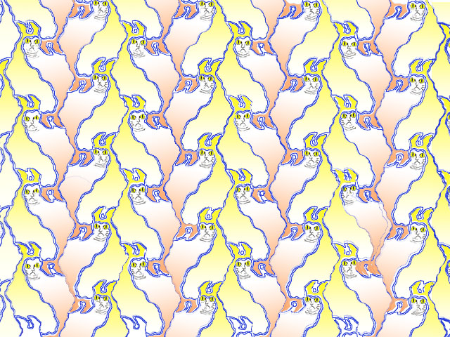
Just about our first post was a tessellation tutorial. It was quite comprehensive, but a bit heavy going. I’ve been wanting to post an animated demo, because I reckon that seeing that first would make the tutorial much easier to follow. So the animation is below, but first, a reminder of the basics:

A tessellation is a pattern like the one above. The cells of the pattern fit together like jig-saw pieces, with no gaps and no overlaps. You can’t make a pattern like that out of just any old shape. It only works with shapes whose edges can be snipped into pairs of segments with special properties. The two segments in each pair must be indentical, except that they may be either reflections of one another, or rotated in relation to one another, like the hands of an old-fashioned clock. Confused already? Just watch this animation, showing the evolution of the pattern above, and you’ll see how it all works.

Continue reading

Art and Camouflage

norwegian carving

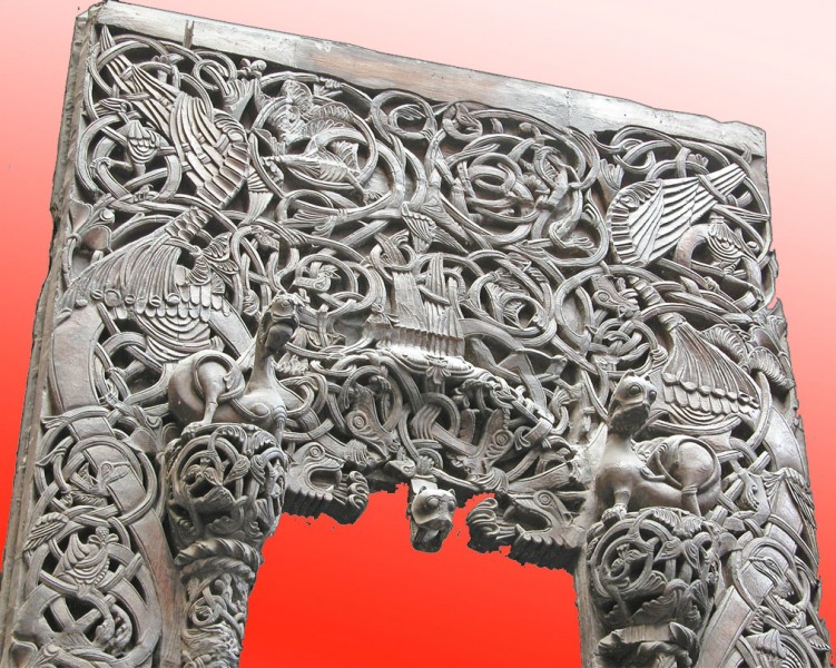
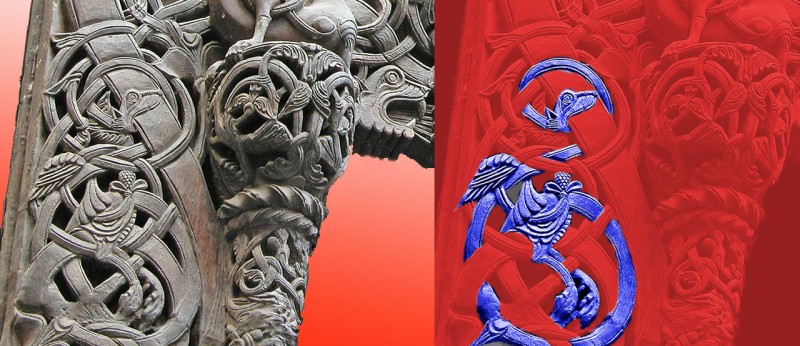
In earlier posts we showed perceptual puzzles in some works of art. Artists, and poets and composers, often seem to use these puzzles, especially ambiguity. (There’s more in Illusions and Aesthetics in the category bar to the right).  Here’s another strategy:  to have a design that’s so complicated that the shapes of anything you might recognise within it are hidden, as if by camouflage. This is an example in carving from an eight hundred year old Norwegian Church doorway. There are fabulous creatures here, but you’ve got to look hard for them.  Here’s a demo to reveal a bird I reckon I can puzzle out. The body’s in the middle, with a wing above it to the left, and two claws hanging down,and then there’s a seriously long serpentine neck, weaving in and out of the plant stems:

A bird concealed in interlace carving

These photos are from a nineteenth century plaster cast in the Victoria and Albert Museum in London.  I’m don’t know if the original church survives, or where in Norway it was.  If anyone knows, please comment.

Interlace camouflage like this was very common in Christian art from fifteen to seven hundred years ago.  Check out the fabulous Irish Book of Kells.  In islamic art representation of creatures was usually not accepted, but arabic inscriptions are often camouflaged in the same way.  The inscriptions in the famous Alhambra in Granada, Spain are so camouflaged they’ve only just been deciphered.  (That’s a news link, at 11/5/09, so I’m not sure how long it be live).

A tessellation pioneer

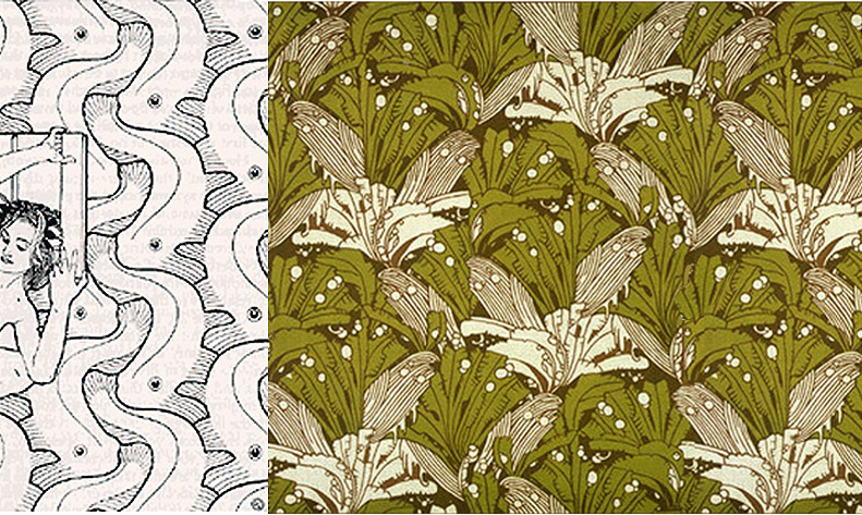
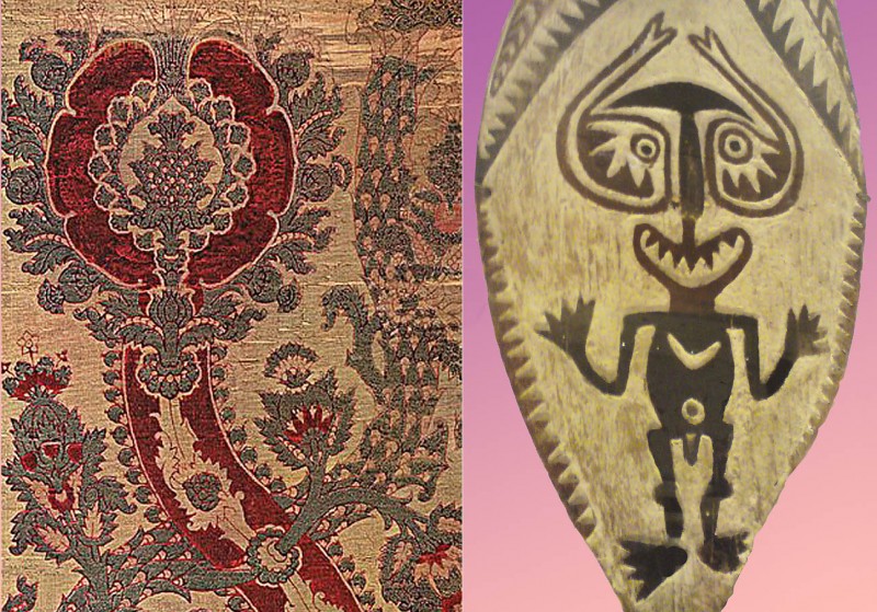
You probably know the tiling patterns of M.C.Escher.  But how about Koloman Moser?  Here are a couple of his designs.

Moser tilings

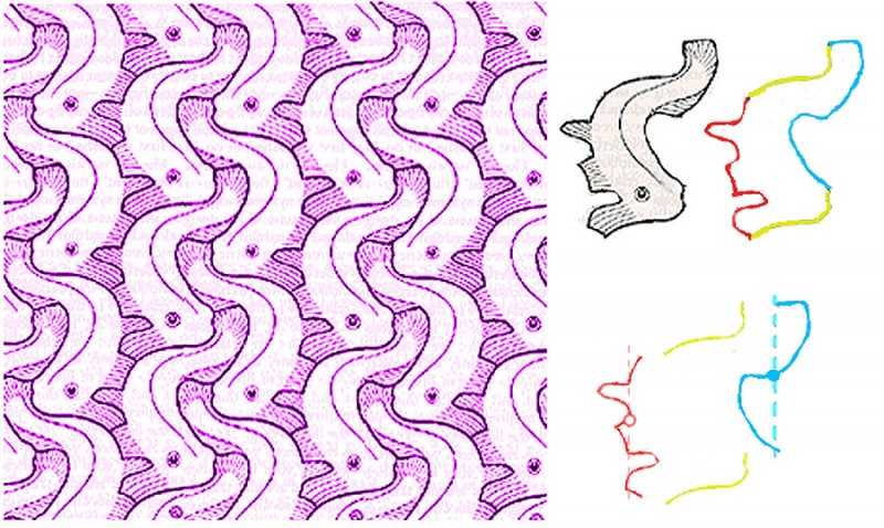
Moser was working in Vienna, Austria, a hundred years ago.  (He died in 1918).  I don’t know where he would have learned to do tessellating designs, that is, designs with motifs that repeat the way jigsaw puzzle pieces fit together, with no gaps or overlaps.  If you have checked out our tessellation tutorial, you’ll know that the secret of these designs is that the edge of each “tile” of the pattern must be able to be snipped into pairs of identical line segments.  Here’s how it works with Moser’s fish design.

Moser design demo

To the right you can see that the fish outline can be divided into three pairs of segments, a yellow pair, a red pair and a blue pair.  In the yellow pair, the top line is just repeated lower down to make the pair, in a move called a translation.  The red and blue pairs are a bit more complicated.  In each pair, the lower line segment is a mirror reflection of the upper segment, but shifted downwards.  That kind of shifted reflection is called a glide reflection.  It’s a fact that any motif whose edges can be snipped into one pair of segments that repeat by translation, connected as here to two parallel pairs whose edges repeat by glide reflection, will tessellate perfectly.  And that’s just one of 28 recipes for motifs that tessellate.

For a more technical account of Moser’s symmetry designs, see:

https://archive.bridgesmathart.org/2019/bridges2019-411.pdf

The author (John M.Sullivan of the Technische Universität Berlin) analyses numerous Moser designs, including the right hand design in the image at the start of the post.  He points out that, in an earlier version of this post, I got the analysis of this fascinatingly complex design wrong.

Mosaic illusions

Mosaic floor at Casale


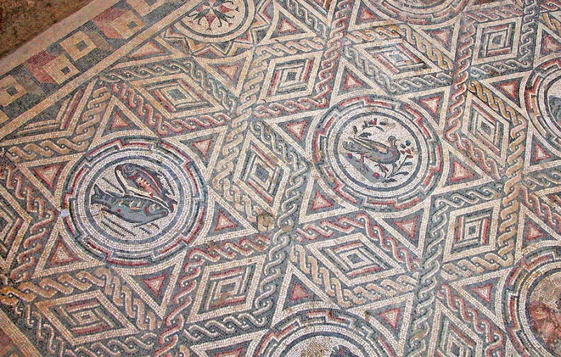
Here’s another example of the way illusion effects have been used in decorative art designs. (For examples in earlier posts, check out the category Illusions and Aesthetics, to the right). This mosaic is one of many from the Villa Romana del Casale, in the middle of Sicily, Southern Italy. Only the floors of this Roman villa are left. They are about 1700 years old, and are the largest expanses of mosaic floor surviving from the ancient classical mediterranean world.

The illusion comes in because different shapes in the design tend to pop out from one moment to the next. For example, in the pictures below I’ve selected out a star and a string of lozenges in the picture on the left, and then a hexagon shape in the picture on the right. Note that the hexagon interlocks with the star beside it with no gaps between them or overlaps, but when we select one, the other kind of vanishes, not only in these demo pictures, but even in the big picture at the start of the post. It’s a figure/ground effect, as in the faces/vase illusion, but without the dramatic light/dark contrast of faces and vase.

Mosaic floor demo
Continue reading

Leonardo Animated (or the New Leonardo Cartoon)

The illusion of movement when a series of images is animated is one we take for granted nowadays. However, here’s a small world first (I think) as new example.  It’s a new Leonardo cartoon.  Actually, there is a Leonardo cartoon already, THE Leonardo cartoon, in London’s National Gallery.  But that’s not a movie. Art historians use the term cartoon for full size drawings for paintings.  But now here’s another Leonardo cartoon, and this one is an animated movie. Maybe a bit short, that’s all.

Leonardo often made anatomical studies from viewpoints in a strict sequence as if moving round the specimen. Some years ago leading Leonardo scholar Martin Kemp pointed out that one famous set of studies, of the shoulder and arm with superficial muscles exposed, contains so many drawings it’s almost cinematic. In fact there are nine views, from three different sheets, which can just about be combined. The drawings are in the British Royal Collection. They have a great website, and here’s one of the Leonardo drawings, showing four arms.

Nine views is just barely enough for a slightly rapid animation.

Leonardo’s observation is so consistent that I only had to adjust overall proportions and contrast a little bit in some cases, in order to combine drawings from different series. It might be possible to make a smoother animation with more adjustment of the images, but I wanted to interfere with them as little as possible.

An effect that in some ways is even better is possible, with just the last two frames in the sequence.

For Leonardo in general, a fun site is the BBC one.  The Wikipaedia Leonardo entry is very good too, with stacks of detailed info.

My short movie may be the first made entirely from a sequence of Leonardo’s own drawings, but it’s not the first based on individual drawings.  Some brilliant, very professional animations were made from Leonardo drawings, for a show at London’s V&A museum in 2006/7.  (I believe the animation was done by Aardman of Bristol).  They developed their own sequences of images from individual drawings, of geometric shapes or machines, which they projected as 3D reconstructions, and then rotated and combined by computer.  I’ve found only one example still on the WWW, but it’s a beauty, based on his drawings of the regular geometric shapes called regular solids.
Puzzling artistic effects

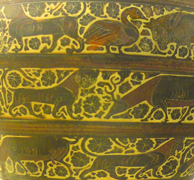
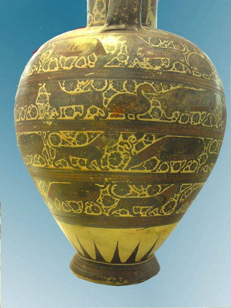
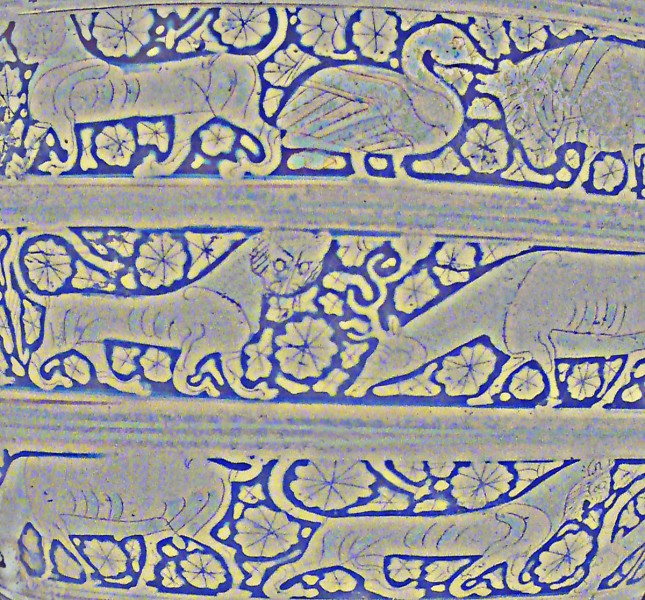
 I wrote in an earlier post about how effective decorative motifs can be if they are ambiguous visually or in some other way a bit of a challenge for perception.  Why that should be is a mystery, but here’s another of my favourite examples, decoration from a pot made in Corinth, Greece, about 595 BCE.

The pot’s in the British Museum and I guess it’s about 70 cms high.  Here’s (nearly) the whole thing.

What’s unusual about this decoration is the way the rosettes and other little decorative motifs in between the animals have expanded to fill almost all the space.  In earlier Corinthian decoration, they were much smaller, just little motifs floating in the pale space round the animals.  Over two or three decades, painters made them fill more and more of the space, until they left only an outline round each animal. I reckon that shows up better in a version of the first picture which I’ve played around with, and reversed so that the pale outlines are dark.

What’s perceptually puzzling about that, I reckon, is that the brain can’t quite decide whether, in this reversed version, these are animals with strong, dark outlines on a pale background, or pale animals silhouetted on a dark background.  If you like doing your own paintings, it’s a brilliant effect to play with, and works just as well with modern motifs, human figures, cars, aeroplanes, umbrellas, you name it.

Ambiguous patterns

I reckon some images look beautiful because they bamboozle the brain processes we normally depend on to make sense of the world.  I don’t know why  that can help make patterns and pictures look beautiful. Nor do I think perceptual puzzlement is the essence of art, or anything like that.  But just from a practical point of view, if you are an artist (or a composer, poet or architect), a motif that’s puzzling can seem to offer a stepping off point for aesthetic effects.

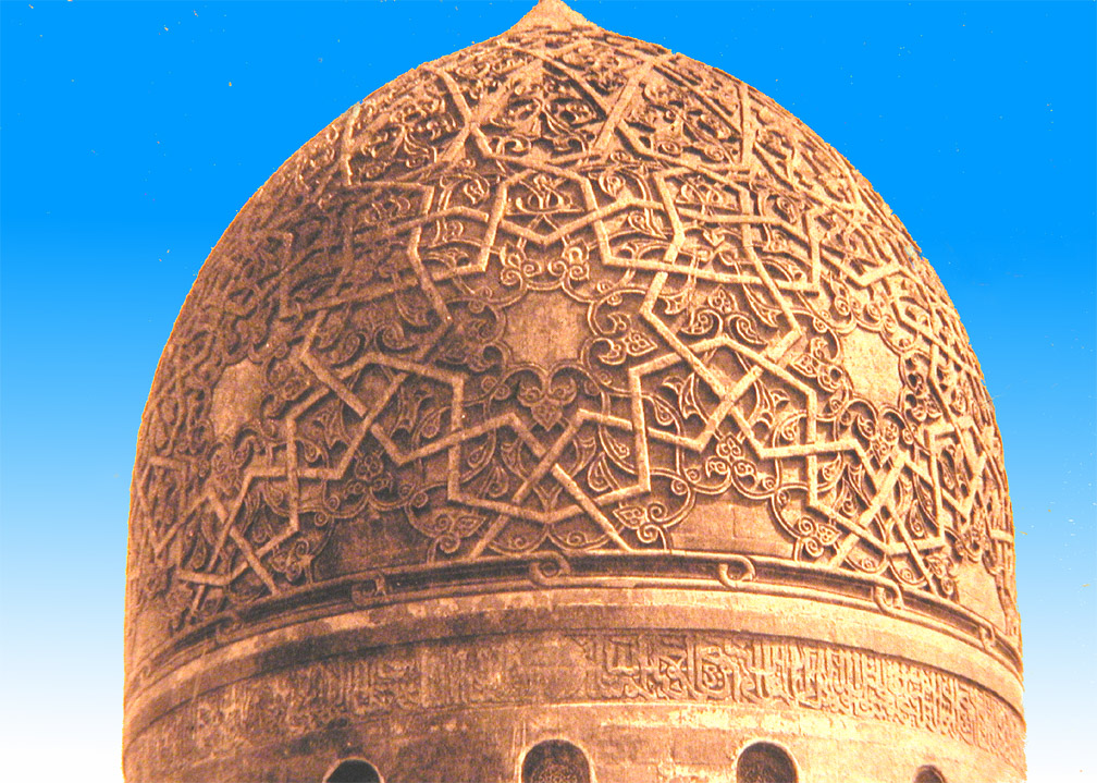
Here are two beautiful examples from architectural decoration, both just about 500 years old.  The first is the dome of the Mausoleum of Sultan Qaitbay in Cairo.

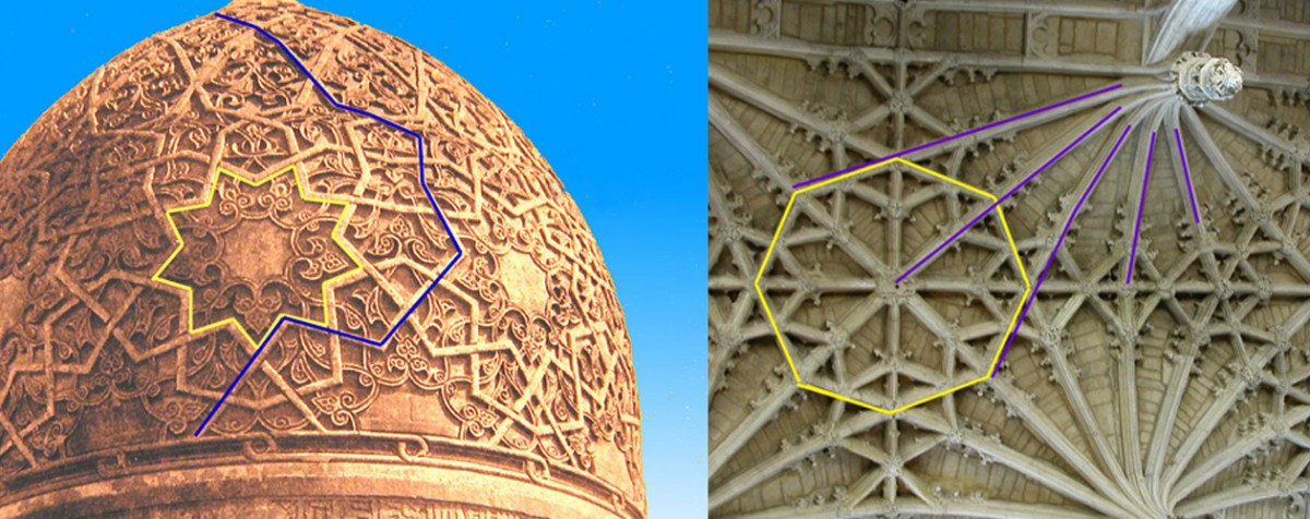
What’s puzzling about this is that a single line segment can be part of the edge of an object, such as a star, and at the same time part of a line that meanders over the whole surface.  Edges don’t behave like that in everyday vision.  Here’s the dome with added lines, left below, to show what I mean. Look at the segment that is labeled with both blue and yellow lines.

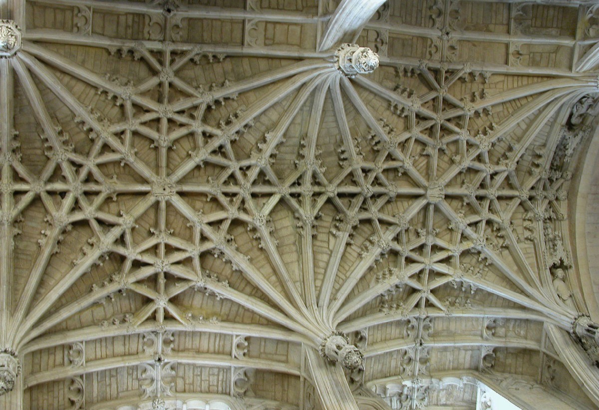
Then note that you can do just the same with the lines that outline the octagons on the ceiling in the picture to the right – every edge is also part of a fan of lines.  That ceiling is in Christchurch Cathedral in Oxford, and we even know who designed it – William Orchard, the Master Mason.  Now we’d call him the architect.  Here’s a picture showing a bit more of the ceiling.

I don’t think it’s just the puzzling features that make these patterns so beautiful.  Interlace patterns like these look like small segments of patterns that go on for ever, and in both Christianity and Islam were a metaphor for perfection and heaven.  And that’s how I reckon artists turn perceptually puzzling effects into something more than amusing images – they choose motifs that are also metaphors for some deeper meaning.

You may be more familiar with interlace as a technology for managing video images.  For interlace as a pattern motif in christian art, see the Wikipedia article on Celtic Knots.  Or try here to find out about interlace patterning in the context of islamic faith.

Tessellations

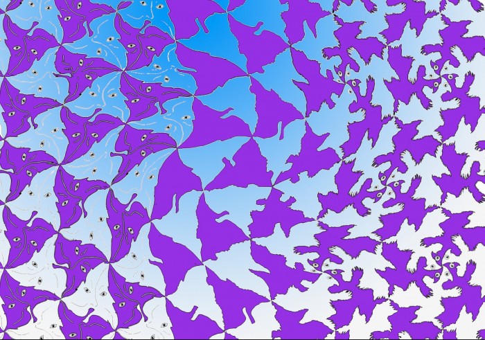
I love tessellations. Here’s quite a complicated example, with a transformation running across it, and an added graphic twist.

Want to try your own tessellations? There are software short-cuts you can use but to really get the hang of them, do them by hand, with a graphics package on a computer. (I use the graphics facility in a full version of Photoshop, but any capable graphics package should do the business. You will need to be fairly handy with it before you start doing tessellations, however). Or you can also really do them by hand, with tracing paper and pencil.

For an extended tutorial, see my tessellation tutorial, or visit another page with outstanding “how-to-do-it” demos.

Note added in March 2011!  If you are new to tessellations, first watch my later post with an animated demo of how tessellations work.

or for demos plus brilliant examples:

http://www.tessellations.org/mygallery16.htm (great examples)

For M.C. Escher’s tessellations see:
http://www.mcescher.com

Here’s my animated tessellation: