
The local tones and colours we see in a scene or image are hugely affected both by the tonal and colour balance of the scene as a whole, and also by the tones and colours immediately adjacent to the patch we are focussed on. The effects can be subtle. Here’s a demo of one, called the Munker-White illusion. The bat (well, it’s a sort of bat shape), in the left hand fractal pattern (it’s a Peano-Gosper curve), looks pale, and the one in the right hand pattern looks dark. And yet the mid tone components of the bat in the left hand image are in fact exactly the same tone and colour as the mid-toned components of the bat to the right.
I think the main process at work in the Munker White illusion is one of enhanced contrast: a mid-tone looks paler when seen against a dark background, and darker against a pale background. Notice that the “bats” don’t just look different in brightness. To the left, the bat could just be a change of tone in the black linework, though it might also be a transparent shape floating in front of the fractal pattern. Either way, the black linework is therefore the reference background for the mid-tone in the left hand image, and the mid-tone looks paler. To the right, the bat looks unequivocally as if floating behind the pattern, so that we see it as if against the white background. That makes the mid-tone appear darker. However, specialists are not agreed that it’s as simple as that, and another process besides contrast may be involved, assimilation. If you’d like to get seriously technical about it, check out this article by Arash Yasdanbakhsh et al. in the journal Perception.
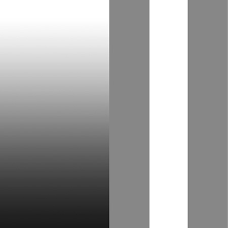
Even straightforward contrast effects can be paradoxical. Here’s an example:

The second bar from the left looks brighter at the bottom than at the top, but it’s in fact all one, even tone, just like the bar to the far right. Its gradation from dark top to pale below is illusory, induced by the real gradation of the bars either side of it. The fourth bar from the left shows pretty much the same gradation, when we compare it with the second bar from the left. But then when we compare the fourth bar from the left with the bar to the far right, both bars look pretty much all one tone. So the fourth bar from the left appears paradoxical, showing change in tone in comparison with the gradation to its left, at the same time as it appears all of a piece when compared to the bar on the far right.
(Sorry about all that “fourth bar from the left” stuff, I’m rather colour blind, and I’ve forgotten what colours these bars are).
Here are two more pretty demos:

The image on the left is just a decorative variation on the demos above: the linework is all one tone, but looks lighter at the top and darker at the bottom because of gradation in the background. The image on the right is a variant of a brilliant and remarkable demo by Edward Adelson. The two arrowed squares, a dark one outside the shadow area, and a pale one within it, are exactly the same tone of grey. That’s really hard to believe. Our brains add the contrast between them, in keeping with the context of the image as a whole. Check out the proof on Adelson’s own website.