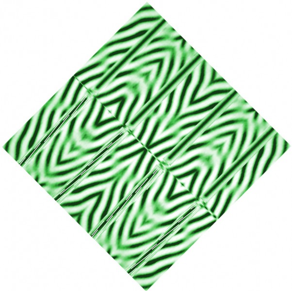
This effect is a bit size sensitive. It works for me with the diamond about 13 cms or 5 inches wide on my screen, and also a bit larger, but not much smaller. I think resolution will need to be good too. All being well, It should show one illusion being overcome by another. All the bars are parallel, but they look wonky. In the top set of four, for example, do the middle pair of bars look just a little further apart near the centre line of the image than towards the upper right edge? The flanking pairs of bars (still just looking at the top set of bars) look to me closer together at the mid-line than at the upper edge. In other words, that upper right set of bars look like they’ve rotated just a touch, opposed to the orientation of the blurry stripes behind them. (That’s the Zöllner illusion). Now check out the lower set of four bars. For me, they look like they’ve rotated in just the same direction – but that’s odd, because I’ve mirror reflected the stripes behind them, so that the stripes have changed direction. So those lower bars appear to have rotated so that they end up slightly more aligned with the stripes behind them.
How so? You’ve guessed, it’s to do with those thin white stripes I’ve added to the lower set of bars. They turn the bars into another illusion of orientation, the twisted cord illusion. The way I’ve done it, that sets the two illusions in competition, and as a result you’d expect the four lower wonky bars to end up looking about just about parallel. That’s about what happens, for example, when the Zöllner illusion goes head to head with the size-constancy illusion. But instead, the twisted cord can overcome the Zöllner illusion. Now, that’s very interesting ……
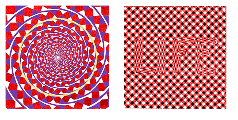
Twisted cord illusions were first studied in detail and published by James Fraser in 1908, with the Fraser Spiral, left below, as his most famous figure. It’s an amazingly strong illusion. Follow the solid pale yellow line, and it turns out to be a circle. The whole figure is a nest of circles, but however well we know that, we cannot see it other than as a nest of spirals. The apparently leaning letters to the right are another example of the effect.
But why should the effect be quite so powerful – so strong, don’t forget, that it completely overwhelms the Zöllner illusion, which is no wimp illusion itself?
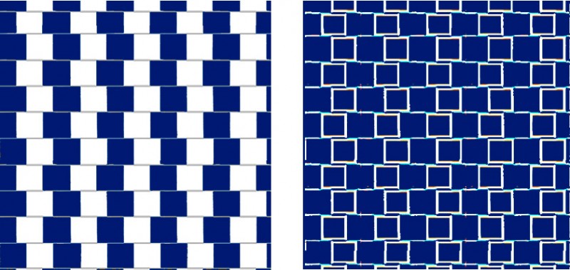
Probably because twisted cord illusions arise very early in visual processing. The information from the retina is distributed through a variety of networks within the brain, but travels many inches in the process. The main route, for example, runs from the retina via way-stations to the back of the brain, through several layers at that point and then to points widely distributed around the brain. Twisted cord illusions probably begin to arise as early as the retina itself or at the first way station thereafter. At that point our visual systems are hyper alert for edges and line segments, and the retinal image is filtered to enhance them. Here’s a demo. It shows to the left a related illusion, the Cafe Wall illusion. The horizontal lines are parallel, but appear slanted. To the right is a version that I have filtered mathematically in a way that imitates one of the main edge enhancement processes that we believe is at work early in the visual pathway.
In the filtered view to the right, there’s no solid white because only the edges of the squares have been passed by the filter. Look what’s happened to the long horizontal edges in the filtering process. They’ve been broken up into separate, slanting line segments, like the ones in the twisted cord illusions earlier in the post. (Note for geeks! What I’ve done to the right above is to model crudely the output of centre/surround cells with a receptive field at appropriate scale, by convolving the figure to the left with a Mexican hat filter. I use the freeware NIH package ImageJ for that sort of thing).
That still leaves open the question of why we see a whole line made up of slanting segments as leaning in the direction of the segments. It seems to me to be an example of a general rule, that we infer global characteristics of images from local properties. Isn’t that why we accept impossible figures, where, for example, the orientation of each corner can seem to make perfect sense, even though the corners add up to a figure that is clearly impossible? (see the posts in the category Impossible Worlds, to the right). Our view of the world at any moment seems to extend like the image on a wide screen, detail from edge to edge, but that of course is an illusion. All the detail is concentrated at the point of fixation, and the rest is largely inference.


