Category Archives: Optical Illusions

Hybrid Portraits

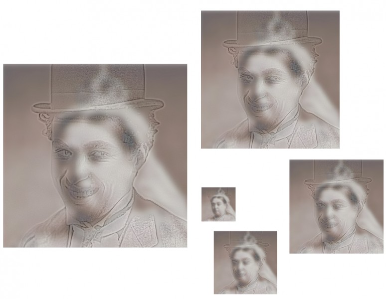
Hybrid portraits superimpose one portrait on top of another, so that one appears with close viewing, and the other emerges with more distant viewing. Or with reduced image size. Or just by taking off your specs, if you are just a little way away and are seriously short-sighted. Whatever works for you, here Charlie Chaplin becomes Queen Victoria. The “top” image is filtered to reduce it so that it resembles an outline drawing, and then made partially transparent (and some viewers might need reading glasses to see it). The ‘back” image is blurred (and may only become apparent when viewed from two or  more meters).

The technique was invented by Aude Oliva, Antonio Torralba and Philippe G. Schyns, and presented in 2006 at the huge annual Siggraph (electronic graphics) conference.  Putting it technically, Charlie here appears with all but his high spatial frequencies filtered out, whilst her late Majesty has had all but her low spatial frequencies filtered away.

But don’t be deterred by the jargon.  If you’d like to try your own hybrid portraits, you can do the filtering very easily if you have a full version of Photoshop to play with, (so long as you’ve got the hang of working with layers).   This is how it works in Photoshop CS2 for Mac.  For the high spatial frequency (outlines) image, with an image file open and the image you want to filter selected, go to filter in the menus at the top of the screen, select other.. (at the very bottom of the list of options) and then high pass.. Then play around! You’ll see how you can transform the image with a slider. For the low spatial frequency (blurry) image, start in a new layer, and once again with the image to filter selected, go to filter again, but this time select blur, and then in the options that open up Gaussian Blur. Once again, then just play around with the slider to explore effects. Then you need to make the top image transparent. Make sure the Layers window is visible (click on layers in the Windows menu at the top of the screen if not). Next make sure the layer holding the top image is selected. Now you can adjust the transparency (they call it opacity) at top right in the layers window.

That’s the easy bit. Once the image pair are more or less presenting the effect OK, adjusting the degree of filtering of the images, their contrast, and then the transparency of the ‘top’ image to find the demon tweak that gives maximum effect will drive you crazy! There is a colossal range of possible combinations.

For some great movies of the effect, try this (MIT) site.

Magic Ring

Here’s a movie of a brilliant, double spiral novelty illusion ring.  It’s available to buy from Grand Illusions, and on that link you can also see another movie of the illusory effect.  As the ring is rotated, it seems to expand when rotated one way, and contract when rotated the other way.

It just may be a version of the kind of ring described in one of the oldest reports of an illusion to have come down to us – a description by the French commentator Montaigne, written nearly five hundred years ago.  In an essay called An Apology for Raymond Sebond he describes …

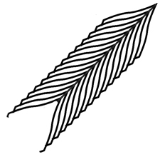
….those rings which are engraved with feathers of the kind described in heraldry as endless feathers – no eye can discern their width, or defend itself from the impression that from one side they appear to enlarge, and on the other to diminish, even when you turn the ring around your finger.  Meanwhile if you measure them they appear to have constant width, without variation …..

Researcher Jacques Ninio quoted that extract in his 2001 book The Science of Illusions (page 15), noting that a design on a ring like the one below looks wider at the top than the bottom, thanks to the Zollner illusion but is objectively the same width all the way along.

All the same, Montaigne’s description of rotating the ring makes me wonder if that’s the whole story.   So I’m on the hunt for surviving mediaeval rings that might decide the issue. And meanwhile, though there are theories about how the Zollner effect arises, no researcher as far as I know has an explanation for the effect shown in the novelty ring available from Grand Illusions (and other suppliers).  I reckon it’s to do with the way that the highlights expand or contract with rotation, but then seem to carry the outline of the object with them.  This is a puzzle which I will be coming back to.

Hidden Message


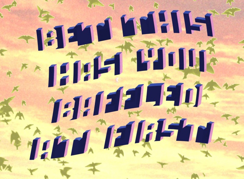
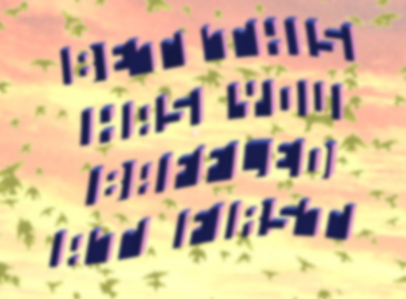
Can you read the message encoded in the image?  A few months back I posted about embedding hidden messages in images. Since then I’ve come across a much better way of doing it, using the lettering in the image above.  Lettering? What lettering?  You may not even have been able to spot the lettering yet. I’m not sure who invented it, but it’s brilliant – I just copied the style of lettering from another demo, on the wonderful website of Michael Bach.  It’s clever because to read the message we have not only to achieve a figure/ground reversal, but also because the distracting objects in the picture are seen as if from above (the default view the brain expects), whilst the hidden lettering is seen from below.  So we have to switch two modes of viewing, figure and ground, and also view from above and view from below.  And then I’ve added scene cues to make it even harder.


However there is a way of revealing the message easily – just blur the image, as in the version below.  Without all the distracting detail in the sharp edges in the scene, all that’s required is a figure/ground reversal, and recognisable letters become the most salient features in the image for the brain.


In my first post on this question, I showed a straightforward exchange between the words Truth and Lies with reversal of figure and ground.  I wanted to tweak that, to add the additional reversal between letters seen from above and from below.  To see that ….

Continue reading

Judith with the Head of Holofernes – or is it the other way round?

Who owns the body?   Judith does to start with, but then Holofernes does, and finally, it’s ambiguous.

Here’s a new addition to our series of ambiguous improved artworks.  Apologies this time are due to Rubens.  I got the idea for these illusions from a print by Picasso.

For a downloadable still of the end of our animation …

Continue reading

The Thiery-Wundt and Muller-Lyer illusions

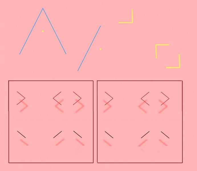
Top left is one of the simplest of all illusions.  The yellow dot is just half way up the vertical height of the triangle, but looks decidedly nearer to the apex. The effect was reported over a century ago, and has been named for its original researchers the “Thiery-Wundt illusion” by recent experimenters Ross Day and Andrew Kimm.  A consensus in recent years has been that we are hard-wired to home in on the “centre of gravity” of the triangle, the point at which three lines bisecting the three angles would meet.  The centre of gravity is a bit lower down than the half-way point of the vertical height of the triangle.  So maybe, the theory goes, we tend to take the centre of gravity as a default central reference point, and so we see the vertical centre point as if shifted a bit towards the apex.  But that can’t be the whole story, researchers Day and Kimm point out, because the effect is still there when the figure is reduced to just one oblique angle side, as centre top in the figure.  In fact, in their experiments, the effect was measured as even stronger that way. So the illusion may look simple, but more than a hundred years after its debut, we’re still basically guessing what’s going on.

Whatever is afoot, it’s probably also involved in the Mueller-Lyer illusion, in which the gap between two inward pointing arrowheads looks larger than an identical gap between two outward pointing ones.  I’ve shown that in 3D in the figure, for viewers who have the knack of so-called “cross-eyed” 3D viewing, without a viewer.  (If that’s new to you, and you want to get the knack, search on Google or try this site – though give it a miss if you have vision problems). But you can see the Mueller-Lyer effect perfectly well in 2D, and for a full discussion of the two illusions, Thiery-Wundt and Mueller-Lyer, if you have access to a research library, see Day and Kimm’s original research paper.  Or for just a bit more ….

Continue reading

Hiroyuki Ito’s new depth illusion

Do you see an effect of depth as if looking into a tunnel in the right hand spinning pattern?  It’s a new depth illusion published by Hiroyuki Ito last year.  It’s not all that strong in my example,  but it’s certainly there to my eye, and it gets stronger if you can increase the size of the animation (or try just looking at the animation from much nearer the screen than usual).  I also find the effect is stronger if I fixate the pattern (still in the right hand image) about half way between the outer edge of the disk and the edge of the central disk.

When you look out of the window of a rapidly moving train, objects near the rail track flash across your field of view in a moment, but landmarks on the horizon trundle past slowly.  In between, there’s a steady gradation, with objects moving across the field of view more and more slowly with distance.  It’s not so hard to animate a texture pattern with similar characteristics, moving across the field of view.  For example, texture elements near the bottom of the image might travel rapidly from left to right, whilst elements higher up the image  track across ever more slowly with increasing height.  An animation like that will give a vivid illusion of depth towards the top of the image.

But nobody realised you can also get an effect of depth with pattern elements rotating around the line of sight.  It might be expected, because normally, when a textured disk rotates, texture near the edge rotates fastest, and texture near the middle slowest, rather as with the usual velocity distribution of moving scene elements. However, when the texture is on a disk, so that elements half way up the disk travel just half as fast as elements near the edge, experience tells us we are simply seeing rotation, and so we see the disk as flat, as to the left above.

Hiroyuki Ito had the idea that if the moving texture on a disk was made to spiral, so that the texture near the edge was going much faster in relation to texture near the centre than it does on a simply rotating disk, we might see an illusion of depth.  And so we do.

Specialists with access to a library subscribing to the journal Perception can consult the full text of Hiroyuki Ito’s article.  It’s a great journal, but unfortunately, without access to that kind of (usually university) library, getting the full text will cost you a crazy amount.  It’s a shame academic journals exclude the tiny number of non-professional readers who’d be interested with that kind of deterrent.  However, I’m not sure I haven’t found a free workaround – if it works, I’ll post.


Sleights of Mind – illusions and magic

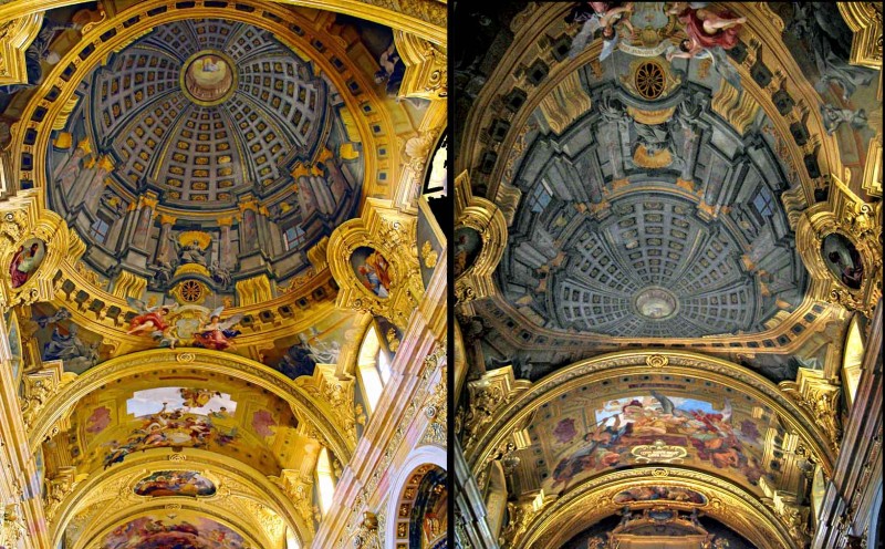
The dome in the left hand picture is an illusion!  It was painted on the ceiling of the Jesuit church in Vienna by Andrea Pozzo a bit over three hundred years ago. Seen from just the viewpoint of the photo on the left, it’s one of the classics of trompe l’oeil painting.  The right hand photo, looking the other way down the nave of the church, shows how Pozzo had to distort his painting of the dome, in order for the perspective illusion to work from a viewpoint near the high altar of the church, as in the left hand photo.   (Copyright might be asserted in these images.  Most of the images on this site are my own or out of copyright, and can freely be used for private, non-commercial purposes, but these are third party photos.  Apologies, I don’t know who took them).

Note added 16/5/17!  I’ve added a post about a ceiling painting in the uk by an artist following where Pozzo led.

I’m posting about the painting in Vienna to draw attention to a fascinating recent book in which Pozzo is featured.  The effect of his paintings, especially in this church and in the Church of Sant’Ignazio in Rome, is almost magically illusionistic, and the book is about what conjuring and magic have to teach us about perception and the brain.  It’s by cognitive scientists Stephen Macknik, Susana Martinez-Conde, with science writer Sandra Blakeslee: Sleights of Mind: what the neuroscience of magic reveals about our brains. The connection between illusions and conjuring has intrigued many researchers, but this is a ground-breaking published study.

Macknik and Martinez-Conde (a married couple, each running a separate research lab) also founded the Best Illusion of the Year Competition, now in it’s seventh year.

Truth Lies Hidden


A few weeks back the site got a load of US visitors from a link from a discussion on Reddit.  Someone got caught out illegally downloading at college, and as a punishment had to produce a poster about the evils of pirating.  The poster was to be inspected by the authorities and if approved, prominently displayed.  So the reluctant poster artist put out a query:  how can you do a poster that seems to say one thing, but when you look again says something very different. Whatever your take on piracy, (there is a vigorous exchange on the reddit site), the poster problem is an interesting one.  I mean, any of us might need to do a subversive poster someday.  Someone responded that pixelation might be a way to do it, and linked to our pixelation post.

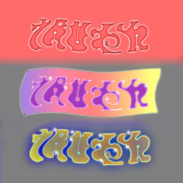
I reckon that would in practice be a really hard way to do it.  Maybe a better way would be by using word combinations that are figure/ground ambiguous, like the Truth/Lies combination shown.  It would still be mighty risky though, if your effort was to be inspected, because it’s hard to tweak the ambiguity just so, leaving the subversive message hidden – but not invisible.  I tried a couple of tweaks above, trying to get a balanced result at top, to push out Truth in the middle, and Lies below.  I haven’t managed to get the recessive message hidden enough yet – not if my freedom depended on it – but maybe you can do better.

Note added at August 3rd 2o11! I’ve come up with a tweaked version of this word pair.  (Scroll down to the bottom of the link).

There are some clever examples of this kind of ambiguity on John Langdon’s site.

80 Illusions poster – compact version


One of our most popular images seems to be the 80 illusions poster.  For everyone wanting a giant version, there’s been one available 35 x 23 inches, on our selling site at www.cafepress.com/optoct.  I was pleased with the quality of the printing when I got one.  Because of the interest, we’ve now reformatted the layout for a smaller version available on the same Cafepress site, 16 x 20 inches.  Both versions have discreet identification under each illusion, so that they can be followed up on this or other sites.  They include little known or novel versions of many famous illusions – and one or two illusions that we think are new.

Watchful heads

I was in a Picasso show recently and noticed the head of a portrait sculpture apparently turning to follow me as I walked past.  More on the Picasso later, the movie above is my reconstruction of the effect, using the head of the emperor Augustus (I think).  It’s not done by animation.  You can set up a static image of your own head at home, and it will apparently turn to follow you as you walk past, not just with the eyes, but with the whole face.  Just imagine what a comfort that could be for your partner – to have your head always keeping an eye on things whenever you can’t be home yourself.

All you need is to print out a photo of yourself, between a three quarter and a full face view, and then fasten it into a concave shape.  I made my concave shape out of a cheap food container, made of some kind of not too hard polymer, so that I could cut it.  As you can see below, I just added a little convex wing at one edge, so that the shape is not all concave, but a bit serpentine.  When I fixed the trimmed photo in the shape, that makes the face concave, but the ear convex.  I reckon the effect works better overall like that, but you might get better results with a bit of experiment.

The real life version will work best if you view it with only one eye as you pass by, or see it from a distance.  That’s because to see the illusion your brain has to overcome the cues telling it the photo is concave, so that you see the face the way the brain insists all faces ought to be, convex.  But then the perspective transformation of the image as you move past is all wrong for a convex shape, and the face only makes sense if seen as rotating.  The effect is related to the Ames Window, and the hollow face illusion.  There’s also a really good YouTube demo using a dragon head.  (Actually, I’ve only just discovered that, and it’s better than my demo, but don’t tell anyone).

I think Picasso may have been the first person to discover this effect, in 1954.

Continue reading