
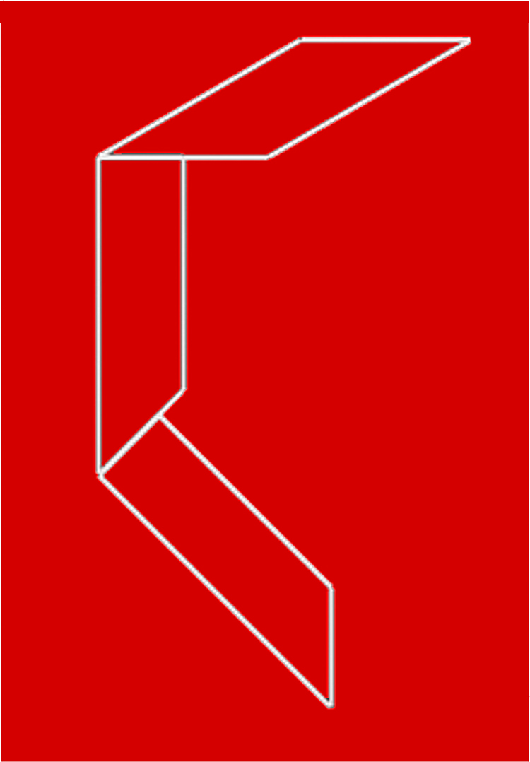
Here’s another illusion only recently reported, by Daniella Bresanelli and Manfredo Massironi of the Universities of Padua and Verona. Look at the three shapes, and most people seem to see the bottom one as thinnest, judging width at right angles to the long edges, the middle one as a bit fatter, and the top one as widest of all (still judging width at right angles to the long edges). In fact, they’re all the same width, and the two bottom shapes are also identical, just rotated in relation to one another.
What’s going on? If you devour technical articles like snacks, see Bressanelli and Massironi’s paper. Otherwise …
What we see in the new figure is likely to involve two principal processes, which seem to be at work in some well-known figures. In one process, we see identical figures as different in size, when they are presented so that a short side of one is adjacent to a long side of the other. Check out the figure to the left below:

It’s called Jastrow’s illusion, and the two blade shapes are indentical, yet the top one seems smaller. Probably, illusion arises because we tweak up the difference in size between the long top edge of the lower blade, and the short lower edge of the top blade. Something similar is probably going on with the two lower shapes in the figure at the start of the post. Here again we tweak up the difference in length between the lower edge of the middle shape, and the top edge of the (identical!) lower shape.
Another contrast effect appears in Titchener’s illusion, (to the right above). The two central spheres are the same size, but the small surrounding spheres to the left make that central sphere seem larger by contrast, whereas the larger surrounding spheres to the right make their central sphere appear smaller.
These demos of the way the brain exaggerates size comparisons can be surprising, but the exaggeration seems to be a very common brain strategy. Note for example that these size contrast effects are analogous to the way that we tweak up tonal contrast in tonal contrast effects. Once our minds are made up about how things are out there, we really go for it. Usually, it helps us get it right, but these illusions reveal how much of the sense that we make of the world is based on assumptions – which can be mistaken.
For example, the second process that seems to be involved in the new figure at the start of the post involves our judgments of size, when similar geometric shapes are seen lying at different orientations in space. Look first just at the left hand of these two figures (Sander’s ilusion):

The two lines running diagonally across the parallelograms are the same length, yet somehow (just how is mysterious) the right hand one seems shorter. Then by adding the figure to the right I’ve combined Sander’s illusion with Shepard’s tables (missing out the table legs). The two large parallelograms are identical, just seen at different rotations, but the one to the right seems longer and thinner than the one to the left. The effect also seems to me to enhance Sander’s illusion, increasing the apparent difference in length between the diagonal lines.
These are once again contrast enhancement effects, but this time playing on our guesses about extension in depth. Because the identical shapes appear to extend into depth, our brains don’t believe they can be identical, and exaggerate what we guess would be their true proportions, if we were not seeing them, apparently, in perspective. So they are exaggerations of comparisons of three dimensional extension, into depth, whereas Jastrow’s and Titchener’s illusions tweak up comparisons of two-dimensional width.
3D Effects like these are surely at work in the new figure at the head of the post as well – but just how is not easy to disentangle from the 2D size contrast effects.
It’s a tribute to the amazing complexity of the brain how obstinately puzzling these simple looking geometric illusions can be, often after more than a century of study: Jastrow’s illusion was published in 1889, Titchener’s in 1898, and Sander’s in 1922 (by someone else – physicist Matthew Luckiesh – but it’s always called Sander’s). The most famous of the so-called geometric illusions, such as Zöllner’s, Poggendorff’s, Hering’s etc., were found even earlier. They seemed to offer clues to the short cuts and specialist tools in the tool-bag of the visual system, but a hundred years on we’re still struggling, and papers written that long ago are still well worth reading.
One thought on “Bressanelli and Massironi’s new illusion”
Comments are closed.