Category Archives: Illusion demos with animations

Animated demonstrations of illusions

A (partly) fake demo of Pulfrich’s Pendulum

To view this illusion, you’ll need the knack of viewing 3D picture pairs without special spectacles, or a viewer – that is, by viewing them cross-eyed. If you haven’t got that trick, and want to try, start with one of our earlier posts on 3D.

If you do have the knack of viewing 3D pictures cross-eyed OK, you should see the pendulum apparently swinging in a circle. It’s MEANT to be a web-based demo of a famous pendulum effect you can fairly easily rig up in real life. It’s called Pulfrich’s pendulum, after researcher Carl Pulfrich, who published it in 1922.  (NB!  Faulty videos replaced at 31/10/15)

Here’s how it should work in real life. You hang up a pendulum, say two meters long, but so that it can only swing from side to side – it must not be free to swing backwards and forwards at all. (Details below on a low-tech way of doing that). You place a reference object under the pendulum, (I use a candle stick), so that the swinging pendulum just misses it, right at the mid-point of the swing. Then you view the swinging pendulum head on, but with a dark filter over one eye. All being well, you should see a really vivid illusion: the pendulum appears to swing not just from side to side, but in a circle. So it seems to swing alternately in front of, and then behind, the centre point marked by the reference object.

So why is my on-screen version here a fake? Read on to find out.

<!–more–>

The effect, in a real life demo, seems to arise because the brain takes longer to process the filtered, darker signal coming via one eye. The position of the pendulum at each moment therefore appears slightly different in each eye. The effect mimics the signal that would reach the brain if the distance of the pendulum from the eye was varying cyclically. The brain therefore infers that the pendulum is most probably swinging in a circle.

I thought it might be possible to imitate the real life effect with an animated stereo pair like the one below, but with one image much darker than the other. In fact, I now doubt it’s possible. Although on a screen one image can appear much darker than another, the strength of the apparent contrast is illusory. Measure the difference between the luminance from the lighter and darker images on-screen and it won’t be much. We see a strong contrast, because of the brain’s power to adapt to different levels of contrast. The difference in luminance from a real scene viewed with and without a dark filter will be far greater. But I thought it might work, and I tried the animation with every trick I could think of. And then suddenly I seemed to have got it. I was REALLY pleased with myself. I could even SEE the darker image as slightly delayed.

It was only the next day that I realised that what I’d done was accidentally to introduce a REAL time difference between the images, instead of an illusory one, arising from the difference in brightness of the pictures. Working in the animation software, (I use After Effects), I’d accidentally nudged an on-screen slider just a millimetre out of position. So what you are seeing here DOES demonstrate that it’s the timing difference that produces the 3D effect with Pulfrich’s pendulum, but you’re NOT seeing an illusory time difference due to brightness contrast. What you are also seeing is how easy it is to fool yourself (me anyway) when playing around with illusion effects.

There’s a really good Wikipedia entry on this effect, complete with details of some amazing 1990’s movie and TV uses of it, done with massive distributions of special specs!

Fancy trying to set up a pendulum yourself?

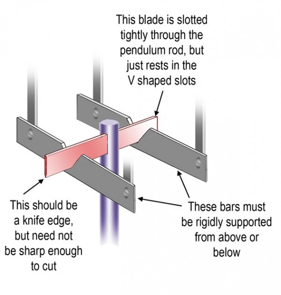
Fixing up a Pulfrich pendulum might be a bit tricky at home, but should be no great problem for a school science department. Here’s one low-tech design for a support armature that will only allow a pendulum to swing from side to side, within a plane, and not into depth.  The support also avoids unnecessary friction, so that the pendulum swings for longer once set in motion.

Support armature for a Pulfrich pendulum

The only other tricky part can be getting the dark filters, for one eye to look through.  I believe sun glasses are usually not dark enough.  I used dark the coloured acetate sheets usually supplied as colour filters for theatrical lighting. They should be available from a local theatre company (only a lens sized piece is needed) or a theatrical supplier.  It’s a stunning demo!

If you wanted to experiment with animated versions, they do have one other virtue. You can get an idea of just how long the time lag has to be, in order for the illusion to appear. I found that with animations running at thirty frames a second, the lag could be no more than one frame! More than that and the two images of the pendulum remained separate. I guess with more frames per second, it would be possible to narrow down the time lag, but the maximum would seem to be about 30 milliseconds.
How to do tessellations – animated demo

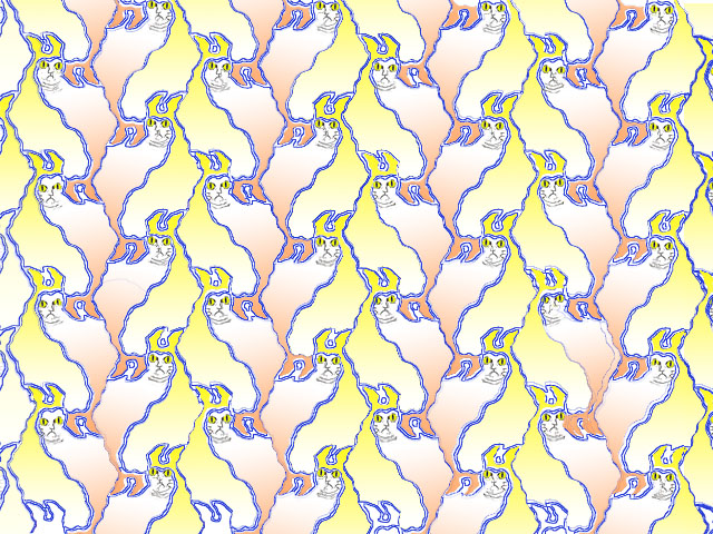
LaidBackCatTessellation

Just about our first post was a tessellation tutorial. It was quite comprehensive, but a bit heavy going. I’ve been wanting to post an animated demo, because I reckon that seeing that first would make the tutorial much easier to follow. So the animation is below, but first, a reminder of the basics:

A tessellation is a pattern like the one above. The cells of the pattern fit together like jig-saw pieces, with no gaps and no overlaps. You can’t make a pattern like that out of just any old shape. It only works with shapes whose edges can be snipped into pairs of segments with special properties. The two segments in each pair must be indentical, except that they may be either reflections of one another, or rotated in relation to one another, like the hands of an old-fashioned clock. Confused already? Just watch this animation, showing the evolution of the pattern above, and you’ll see how it all works.

Continue reading

Adelbert Ames II

This is a variant on one of the famous demonstrations devised by USA born Adelbert Ames II, the Ames Window.  Watch the name Adelbert rotate, and it just goes around clockwise.  So does its shadow.  But then watch the name Ames II rotate.  At a certain point, it changes direction, and starts to rotate anti-clockwise. At that point, I find I can see the shadow of Ames II go around either way.

The change in direction appears because what’s rotating is not the name Ames II as it would usually appear on a page, but a perspective view of it. It’s receding into the distance with the A end nearer to us, and large, and the II end further away, and smaller. But that means that as the name rotates, at a certain point the smaller end starts to get nearer to us, and the larger end further away. That’s so contrary to anything that ever happens in everyday vision that our brains won’t accept it.  The instant the smaller end of the name tries to swing past the point at which it would be nearer to us than than the large end, the rotation appears to reverse.  The reversal looks a bit odd, but that’s a price our brains seem happy to pay, if it keeps the large and small ends of the name looking like they’re where they should be.

If my attention is on the Ames II bit of the image, in my periphery strange things also start to happen to the Adelbert bit.  When Ames II changes direction it seems to pull Adelbert around with it.  That’s OK for the first quarter turn, when the letters of Adelbert are seen as if from the back. But once they swing round to a front view, there’s a conflict and I’m not quite sure which way it’s turning.

The demo is just about the opposite of the earlier post with the figure of Mercury rotating.  In that demo, the rotation of the silhouette is ambiguous.  There’s nothing ambiguous about the Ames demo:  the lettering enforces one direction of rotation at any point, even if the result requires an about turn.

There’s a brilliant online demo of the window version with a commentary , and also with a visually baffling added feature, by psychologist Richard Gregory.

Position cues from a moving shadow

Does the ball sometimes seem to be bouncing, and moving nearer and further away?  Look again just at the track of the ball and you’ll see that all it ever does is to move diagonally from one corner of the board to the other. The spatial effects, and even the way the ball seems to accelerate at points, are all down to the moving shadow.

When the shadow sticks to the ball, the ball seems to just move across the surface and into the distance. That’s remarkable, because the ball should appear smaller with distance, but in fact the image of the ball here doesn’t change. The shadow cue is so strong it over-rides the problem. As the shadow drops to the foot of the image, the ball appears higher in the space, but nearer to us.

Once again, the effects appear even though the ball does change at all in size, as it should according to the rules of perspective – though some viewers might see an illusion of size-change, compensating for the anomalous lack of real size change.

I’ve tried to base my animation demo pretty closely on one described by Daniel Kersten and colleagues in 1997, in their celebrated original publication of this effect.

Tessellation Animation

The Dutch tessellation whizz M.C.Escher was fascinated by transformations from one tessellation to another, for example in his series of prints Metamorphosis. I’m sure he would have explored animated versions if it had been practical in the 1940’s. So I’ve borrowed a couple of his motifs and animated them. I showed an animated transformation in an earlier post, but that was between two designs that shared the same kind of symmetry. (See the earlier tessellation tutorial for how these tessellations work. If you like technical detail, my earlier animation was of two motifs based on Heesch tessellation no. 11). Sticking to just that one kind of tessellation meant that the corners of each cell of the design had to remain stationary, and only the edges of the cells transformed. This new transformation is a bit different, because it’s not just a transformation from one motif to another, but between two different kinds of symmetry pattern – Heesch nos 17 and 18 in the tutorial – and the corners of the cells of the pattern are not fixed.

In the earlier transforming animation, the design transformed in space, across the image, as well as transforming in time. If I’ve got it right, (I’m not 100% sure about this), that kind of time plus space transformation is not possible in an animation if the corners of the cells of the tessellation change position, as in my new tessellation above. So in this new animation, there’s no change from cell to cell across the design, and all the cells transform together.

I’m fascinated by the artistic possibilities of these kinds of animation, and one aspect of it is to do with what you might call the dance rhythms of the animation. Here’s a variation on the new animation, speeded up and with an added wave that gives a quite different kind of pulse to the design.

These animations are bit monochrome for the moment – colour is on the way, but I’m on a steep learning curve with file sizes, compression etc.

Leonardo Animated (or the New Leonardo Cartoon)

The illusion of movement when a series of images is animated is one we take for granted nowadays. However, here’s a small world first (I think) as new example.  It’s a new Leonardo cartoon.  Actually, there is a Leonardo cartoon already, THE Leonardo cartoon, in London’s National Gallery.  But that’s not a movie. Art historians use the term cartoon for full size drawings for paintings.  But now here’s another Leonardo cartoon, and this one is an animated movie. Maybe a bit short, that’s all.

Leonardo often made anatomical studies from viewpoints in a strict sequence as if moving round the specimen. Some years ago leading Leonardo scholar Martin Kemp pointed out that one famous set of studies, of the shoulder and arm with superficial muscles exposed, contains so many drawings it’s almost cinematic. In fact there are nine views, from three different sheets, which can just about be combined. The drawings are in the British Royal Collection. They have a great website, and here’s one of the Leonardo drawings, showing four arms.

Nine views is just barely enough for a slightly rapid animation.

Leonardo’s observation is so consistent that I only had to adjust overall proportions and contrast a little bit in some cases, in order to combine drawings from different series. It might be possible to make a smoother animation with more adjustment of the images, but I wanted to interfere with them as little as possible.

An effect that in some ways is even better is possible, with just the last two frames in the sequence.

For Leonardo in general, a fun site is the BBC one.  The Wikipaedia Leonardo entry is very good too, with stacks of detailed info.

My short movie may be the first made entirely from a sequence of Leonardo’s own drawings, but it’s not the first based on individual drawings.  Some brilliant, very professional animations were made from Leonardo drawings, for a show at London’s V&A museum in 2006/7.  (I believe the animation was done by Aardman of Bristol).  They developed their own sequences of images from individual drawings, of geometric shapes or machines, which they projected as 3D reconstructions, and then rotated and combined by computer.  I’ve found only one example still on the WWW, but it’s a beauty, based on his drawings of the regular geometric shapes called regular solids.

A New(?) Ever Receding Staircase

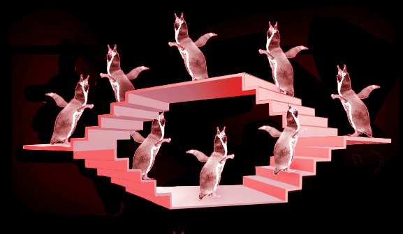
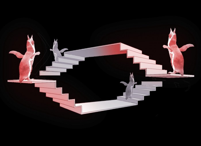
Here’s a new kind of never-ending stair (I think).  It’s like the famous never-ending staircase seen from above by M.C.Escher, called Ascending and Descending.  However, in this new staircase instead of figures doomed to go downstairs for ever we have penguins destined to walk away from us forever.  It’s based on the geometry of the object in my post on paradoxical size-constancy.

New Penguin Stair

Here’s an animated version:

Like Escher’s famous impossible staircase, (and also as with the impossible tribar), the effect depends on our seeing a scene from a viewpoint from which points that would be at different distances from us seem to connect up. Here’s a view in more usual perspective of one configuration that would give rise to the ever receding staircase above. The trick depends not just on getting the alignment just right, but also on suppressing the usual perspective cues.  Size diminution with distance is the most important one.  The other is aerial perspective, in which contrast flattens out and colours get bluer with distance. I’ve put them both back below.


For more on staircases like Escher’s famous picture Ascending and Descending …..

Continue reading

Revolving Heads

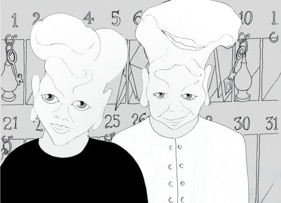
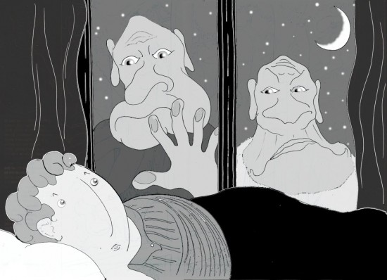
Heads that present one character one way up and another when rotated have been favorite illusions for over a century. Here are two heads from a cartoon story I devised about a boy who gets stuck in a weird hotel. The receptionist and chef, (Mr. and Mrs. Turner …. ) seem OK at first, but then transform into two sinister old men when their heads rotate.

For an animation of Mr. and Mrs. Turner see below:

There are loads of great rotating heads at:

http://members.lycos.nl/amazingart/E/6.html Rotating Heads

Tessellations

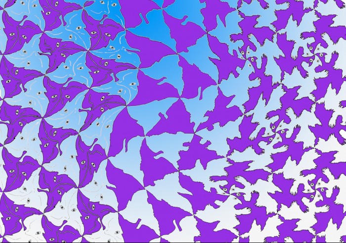
I love tessellations. Here’s quite a complicated example, with a transformation running across it, and an added graphic twist.

Want to try your own tessellations? There are software short-cuts you can use but to really get the hang of them, do them by hand, with a graphics package on a computer. (I use the graphics facility in a full version of Photoshop, but any capable graphics package should do the business. You will need to be fairly handy with it before you start doing tessellations, however). Or you can also really do them by hand, with tracing paper and pencil.

For an extended tutorial, see my tessellation tutorial, or visit another page with outstanding “how-to-do-it” demos.

Note added in March 2011!  If you are new to tessellations, first watch my later post with an animated demo of how tessellations work.

or for demos plus brilliant examples:

http://www.tessellations.org/mygallery16.htm (great examples)

For M.C. Escher’s tessellations see:
http://www.mcescher.com

Here’s my animated tessellation: