Category Archives: Illusion demos with animations

Animated demonstrations of illusions

Cockatoo coming through

One of my favourite René Magritte paintings is Carte Blanche. (There seem to be problems linking to an image of that – I guess copyright related – but just put that title into an image search).  I’ve two earlier posts that play on the same effects – an image for Halloween and a classical scene.   I’ve always wondered if the effect would be even stronger and stranger in an animation.  So here it is.

Usually an area of the visual field within an outline, or more or less bounded by an outline, is either an object or an aperture.  (One of my earliest posts on the site is also about that).  We are so good at not getting those mixed up in everyday vision that when they get mixed up in a picture, like the Magritte painting or my examples, the effect is strangely disconcerting.

Thanks to Edweard Muybridge for the loan of the Cockatoo.

Poggendorff Switch

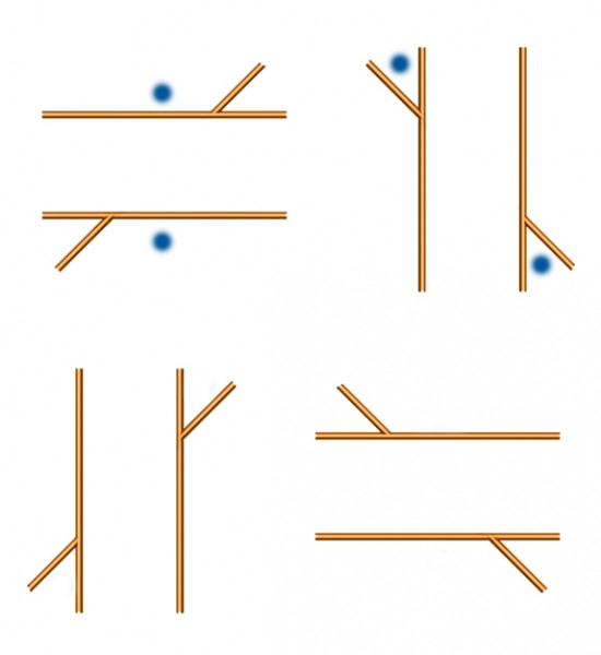
If the way I see this animation is how most people do, the strength of the Poggendorff illusion can depend on our patterns of fixation when looking at it.  Adding distracting dots to the figure can attract the eye either obliquely along the parallels or at right angles across them.  To my eye, when the oblique track between the acute angles in the figure is labelled with flashing blobs, the strength of the illusion is reduced.  When the track at right angles across the parallels is labelled, effect is maximised.  The effect doesn’t change instantly for me, but settles down after each track has flashed two or three times.  I get the same effect if I switch fixations every second or so between equivalent blobs in still Poggendorff figures. The effect is strongest, as below, when the blobs are in the acute angles when the parallels are vertical, and across parallels when the parallels are horizontal.  So in the figure below, the illusion is not far off equal strength for me in the bottom pair of figures, but looks maybe a bit stronger at top left, and has almost vanished at top right.

If you’d like more on this, plus some additional demos, check out my site devoted to the Poggendorff illusion.

Barrier-Grid (or Picket-Fence) Animation

In recent versions of these animations, as in the movie above, a grid of thin transparent lines in a mask is passed over a composite graphic image, to give an illusion of movement.  In earlier versions, made in France in the the 1920’s and called Ombro cinema or cinema enfantin, the grid of transparent lines was static in a viewing frame, and a strip of the composites was spooled behind it.  (There’s a nice demo from the North West Puppet Center in Seattle).  Earlier versions still go back to the 1890’s and are described in a very authoritative Wikipedia entry.

A beautiful recent booklet of barrier-grid animations is Colin Ord’s Magic Moving Images.  In 2006 a new  version of the technique, in which the act of opening a book automatically draws the grid over the image, was patented by Rufus Butler Seder, called Scanimation. He’s also published a number great books for kids using his process.

(By the way, there also used to be an entirely separate early computer animation machine, in the 1960’s, called The Scanimate).

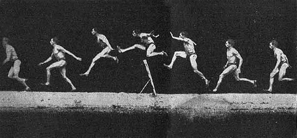
In Seder’s and Ord’s books, the illusion happens in the real world, when you pass a real striped acetate mask over the composite base image. My demo is an animation that faithfully follows the real world process, as if a real striped mask was being passed over the base image.  I borrowed the jumping man from this composite photo by nineteenth century movement scientist Etienne Marey.

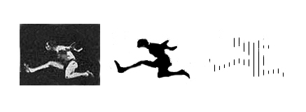
To make a barrier grid animation, you reduce the subject in each ‘frame’ of the original movie into a black silhouette, and then replace the black infill with a hatching of just a few vertical lines.

The hatched silhouettes are then combined into a composite image, like the one in the animation at the head of the post.  As the striped mask passes over it, only one frame at a time is revealed.  The jumper in the final, striped silhouette (right hand of the three images) above is barely recognisable as a figure. We see the jumper much more clearly in the movie. I find it a bit magical the way the jumper quite gradually appears in the movie as the mask begins to move over the composite image from the left. Our brains can discover figures in patterns of amazingly sparse data, if only they move coherently, as when the human body is represented just by dots at the key rotation points (such as knees and elbows).

Want to have a go at making a barrier grid animation yourself?

Continue reading

Drunken Dionysius

The butterflies appear to circulate in time to the heartbeat of Dionysius (the ancient Greek God of wine), yet they never change position.  The movement is an illusion.  Only the tones and colours are changing, and movement appears as light butterflies on a dark ground change to darker ones on a lighter ground, and as light edges of the butterflies change to dark, and vice versa.  You may also see similarly evoked movement on the chest and stomach of Dionysius, in time with his breathing.

Compression for Flash has rather trashed animation quality. If possible, view Drunken Dionysius as a
Quicktime Movie

Here’s a related illusion, a new version of the Duck/Rabbit illusion.

The yellow central panel appears to move, but remains objectively quite stationary.  The edges don’t move either, all that changes is that black edges switch to white, and vice versa.

These effects are related to those in the Bouncing Brains Illusion, an entry by Thorsten Hansen and colleagues (University of Giessen, Germany) for the Best Visual Illusion of the Year contest 2007.

They are also related to the peripheral drift illusion.  A beautiful new example of that illusion by Kaia Nao (aka wildlife artist Joe Hautman) was one of the final 10 entries in this year’s Best Visual Illusion of the Year contest (the whole contest is not to be missed!).

All these illusions are thought to arise in peripheral vision because of differences in the speed of brain processing of the light and dark edges of the elements in these patterns.  The ones presenting most contrast are processed quickest.  Because the timing differences and their direction across similarly orientated pattern elements are syncronised, they are picked up by movement detectors in peripheral vision, and interpreted as movement of whole blocks of elements. For another example of apparent movement in a completely static image, see our earlier Ocean Wave Illusion.

If you devour scholarly research articles, here’s one on what may be going on in these illusions in more detail.

Muller-Lyer paradox (amended post)

Here’s a new way of looking at the Muller-Lyer illusion – paradoxically.

In the Muller-Lyer illusion, a line segment ending with outward pointing arrowheads looks shorter than an identical segment ending with inward pointing arrowheads. So in this version, whenever the arrowheads are visible, the left end of the line looks shorter than the (objectively identical) right end.

Here’s the paradox. When the arrowheads appear, the line segments instantly appear different in length, and yet the positions of the little globes marking the ends and centre-point of the line don’t appear to shift at all – which is impossible.

To make the point, in the bottom line, I’ve added an animated shift in the position of the middle globe, of just about the extent needed to produce the difference in apparent lengths of the line segments induced in the top line by the arrowheads.

The paradox is an example of the way that these so-called geometric illusions are not really so geometric.  Draw a figure, and if you change the length of a line, at least one of the line endpoints has to shift as well.  But in perceptual space it doesn’t necessarily follow.  So perceptual space can be pretty weird, or as researchers sometimes call it, non-Euclidean, because it isn’t always bound by the rigid constraints set out by the ancient Greek geometer Euclid.

(I’ve changed this post at 16/5/12.  There was other stuff in the original version, but it got much too complicated).

Magic Ring

Here’s a movie of a brilliant, double spiral novelty illusion ring.  It’s available to buy from Grand Illusions, and on that link you can also see another movie of the illusory effect.  As the ring is rotated, it seems to expand when rotated one way, and contract when rotated the other way.

It just may be a version of the kind of ring described in one of the oldest reports of an illusion to have come down to us – a description by the French commentator Montaigne, written nearly five hundred years ago.  In an essay called An Apology for Raymond Sebond he describes …

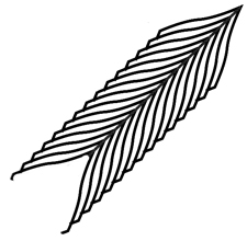
….those rings which are engraved with feathers of the kind described in heraldry as endless feathers – no eye can discern their width, or defend itself from the impression that from one side they appear to enlarge, and on the other to diminish, even when you turn the ring around your finger.  Meanwhile if you measure them they appear to have constant width, without variation …..

Researcher Jacques Ninio quoted that extract in his 2001 book The Science of Illusions (page 15), noting that a design on a ring like the one below looks wider at the top than the bottom, thanks to the Zollner illusion but is objectively the same width all the way along.

All the same, Montaigne’s description of rotating the ring makes me wonder if that’s the whole story.   So I’m on the hunt for surviving mediaeval rings that might decide the issue. And meanwhile, though there are theories about how the Zollner effect arises, no researcher as far as I know has an explanation for the effect shown in the novelty ring available from Grand Illusions (and other suppliers).  I reckon it’s to do with the way that the highlights expand or contract with rotation, but then seem to carry the outline of the object with them.  This is a puzzle which I will be coming back to.

Judith with the Head of Holofernes – or is it the other way round?

Who owns the body?   Judith does to start with, but then Holofernes does, and finally, it’s ambiguous.

Here’s a new addition to our series of ambiguous improved artworks.  Apologies this time are due to Rubens.  I got the idea for these illusions from a print by Picasso.

For a downloadable still of the end of our animation …

Continue reading

Hiroyuki Ito’s new depth illusion

Do you see an effect of depth as if looking into a tunnel in the right hand spinning pattern?  It’s a new depth illusion published by Hiroyuki Ito last year.  It’s not all that strong in my example,  but it’s certainly there to my eye, and it gets stronger if you can increase the size of the animation (or try just looking at the animation from much nearer the screen than usual).  I also find the effect is stronger if I fixate the pattern (still in the right hand image) about half way between the outer edge of the disk and the edge of the central disk.

When you look out of the window of a rapidly moving train, objects near the rail track flash across your field of view in a moment, but landmarks on the horizon trundle past slowly.  In between, there’s a steady gradation, with objects moving across the field of view more and more slowly with distance.  It’s not so hard to animate a texture pattern with similar characteristics, moving across the field of view.  For example, texture elements near the bottom of the image might travel rapidly from left to right, whilst elements higher up the image  track across ever more slowly with increasing height.  An animation like that will give a vivid illusion of depth towards the top of the image.

But nobody realised you can also get an effect of depth with pattern elements rotating around the line of sight.  It might be expected, because normally, when a textured disk rotates, texture near the edge rotates fastest, and texture near the middle slowest, rather as with the usual velocity distribution of moving scene elements. However, when the texture is on a disk, so that elements half way up the disk travel just half as fast as elements near the edge, experience tells us we are simply seeing rotation, and so we see the disk as flat, as to the left above.

Hiroyuki Ito had the idea that if the moving texture on a disk was made to spiral, so that the texture near the edge was going much faster in relation to texture near the centre than it does on a simply rotating disk, we might see an illusion of depth.  And so we do.

Specialists with access to a library subscribing to the journal Perception can consult the full text of Hiroyuki Ito’s article.  It’s a great journal, but unfortunately, without access to that kind of (usually university) library, getting the full text will cost you a crazy amount.  It’s a shame academic journals exclude the tiny number of non-professional readers who’d be interested with that kind of deterrent.  However, I’m not sure I haven’t found a free workaround – if it works, I’ll post.
 

Watchful heads

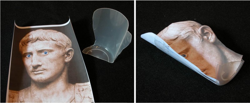
I was in a Picasso show recently and noticed the head of a portrait sculpture apparently turning to follow me as I walked past.  More on the Picasso later, the movie above is my reconstruction of the effect, using the head of the emperor Augustus (I think).  It’s not done by animation.  You can set up a static image of your own head at home, and it will apparently turn to follow you as you walk past, not just with the eyes, but with the whole face.  Just imagine what a comfort that could be for your partner – to have your head always keeping an eye on things whenever you can’t be home yourself.

All you need is to print out a photo of yourself, between a three quarter and a full face view, and then fasten it into a concave shape.  I made my concave shape out of a cheap food container, made of some kind of not too hard polymer, so that I could cut it.  As you can see below, I just added a little convex wing at one edge, so that the shape is not all concave, but a bit serpentine.  When I fixed the trimmed photo in the shape, that makes the face concave, but the ear convex.  I reckon the effect works better overall like that, but you might get better results with a bit of experiment.

The real life version will work best if you view it with only one eye as you pass by, or see it from a distance.  That’s because to see the illusion your brain has to overcome the cues telling it the photo is concave, so that you see the face the way the brain insists all faces ought to be, convex.  But then the perspective transformation of the image as you move past is all wrong for a convex shape, and the face only makes sense if seen as rotating.  The effect is related to the Ames Window, and the hollow face illusion.  There’s also a really good YouTube demo using a dragon head.  (Actually, I’ve only just discovered that, and it’s better than my demo, but don’t tell anyone).

I think Picasso may have been the first person to discover this effect, in 1954.

Continue reading

Shepard’s Tables – what’s up?

This is an animation of Shepard’s Tables, an illusion first published by Roger Shepard as Turning the Tables, (see his wonderful book Mind Sights, 1990, pages 48 and 127-8). The left hand lozenge-shaped table top seems to get longer and thinner as it rotates, but it’s an illusion. It remains identical to the right hand table-top, except for rotation. The table-tops look even more different as the legs appear. The illusion is an example of size-constancy expansion – the illusory expansion of space with apparent distance. The receding edges of the tables are seen as if stretched into depth. Earlier posts on size-constancy showed how objects can appear wider with distance. That shows up with Shepard’s tables too, in the way that the oblique edges of the tables seem to get a bit wider apart with distance. The stretch into depth is more striking.

Recently Lydia Maniatis pointed out a puzzling aspect of the illusion, in her prize-winning entry for the Illusion of the Year Competition. Here’s a version of her figure.

Lydia Maniatis's Shepard's Tables puzzle

All three table tops are identical, but the middle one looks different from the one on the left, though it’s not even rotated. Instead the vertical axis of the figure is shown at an angle to gravitational vertical. That means that the blue edges are no longer aligned with the frontal plane of the image, as to the left, even though they are horizontal on the page, but must be receding into distance. And yet we don’t see the dramatic stretch into depth that appears with oblique edges that recede into distance. Why not?  Try looking at the middle block with your head leaning over to the left, so that the short edges are aligned with your head, and therefore with the vertical axis of your field of view.  Now (for me) the blue edges do stretch into depth, though not as much as in the right hand image viewed normally.

What do you think is going on?  I’ll take a shot at an explanation in a post in a couple of days.