Category Archives: Size-constancy effects

Bars and Bands – illusory expansion

When the chevron pattern in the movie is in perspective, so that the bars get thinner and closer together with distance, the bars and the fan of bright bands on them appear to stream past us, as if we were travelling along a tunnel. When the bars are all the same size and equally spaced, so that they don’t show perspective depth cues, the fan of bright bands appears to be expanding. The outer bright bands even look as if they are sliding along the bars.

Thanks to Priscilla Heard for the suggestion that the key to the expansion effect is in the absence of perspective cues. If you’d like more on that ….

Continue reading

The Thiery-Wundt and Muller-Lyer illusions

Top left is one of the simplest of all illusions.  The yellow dot is just half way up the vertical height of the triangle, but looks decidedly nearer to the apex. The effect was reported over a century ago, and has been named for its original researchers the “Thiery-Wundt illusion” by recent experimenters Ross Day and Andrew Kimm.  A consensus in recent years has been that we are hard-wired to home in on the “centre of gravity” of the triangle, the point at which three lines bisecting the three angles would meet.  The centre of gravity is a bit lower down than the half-way point of the vertical height of the triangle.  So maybe, the theory goes, we tend to take the centre of gravity as a default central reference point, and so we see the vertical centre point as if shifted a bit towards the apex.  But that can’t be the whole story, researchers Day and Kimm point out, because the effect is still there when the figure is reduced to just one oblique angle side, as centre top in the figure.  In fact, in their experiments, the effect was measured as even stronger that way. So the illusion may look simple, but more than a hundred years after its debut, we’re still basically guessing what’s going on.

Whatever is afoot, it’s probably also involved in the Mueller-Lyer illusion, in which the gap between two inward pointing arrowheads looks larger than an identical gap between two outward pointing ones.  I’ve shown that in 3D in the figure, for viewers who have the knack of so-called “cross-eyed” 3D viewing, without a viewer.  (If that’s new to you, and you want to get the knack, search on Google or try this site – though give it a miss if you have vision problems). But you can see the Mueller-Lyer effect perfectly well in 2D, and for a full discussion of the two illusions, Thiery-Wundt and Mueller-Lyer, if you have access to a research library, see Day and Kimm’s original research paper.  Or for just a bit more ….

Continue reading

Shepard’s tables – What’s up? (post no. 3)

nested Shepard's tables demonstrating size-constancy lateral expansion

This is a third look at the Shepard’s tables illusion. If you didn’t see the earlier posts, you might like to get up to speed on the illusion by scrolling down two posts to an animated demo. The two pairs of table-tops in these views are absolutely identical, and within each pair the two lozenge shapes are identical except that one is seen short end on, and the other wide side on. However, they don’t look identical. Most dramatically, the lower table in the left hand image looks much longer and thinner than the upper table. But we don’t see that stretch into depth in the identical pair of table-tops in the right hand image. They look quite different, just because the tables are shown tipped over.

The stretch-into-depth of the lower table in the left hand image is a kind of size-constancy effect. But the tables also show a more familiar kind of size constancy effect.  Check out the blue lines in the left hand image (left edge of the upper table and alignment of the bottom of the table legs). Those blue lines are parallel, but to my eye they look as if they get wider apart with distance.

In the left hand image, to my eye, only the blue lines show apparent divergence with distance. The horizontal edges (yellow) and the vertical table legs (red edges) stay parallel for me. But in the right hand picture, just tipping the tables over makes all three pairs of coloured edges appear to diverge with distance. The effect may not be very strong. It’s easier to see in bigger versions of the pictures, so I’ll add those in in what follows, where I want to pose a question: are the differences between the table-tops as seen upright and tipped over only to do with how we see pictures, or are they a clue to how we see more generally?

Continue reading

Shepard’s Tables – what’s up? (post no. 2)

Nested Shepard's Tables

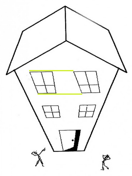
The previous post presented an animation of Shepard’s Tables. If you didn’t see that, you might want to check it out first (scroll down to the previous post) to get the basics of the illusion. This new version of the illusion, with nested tables, follows the pattern: all eight of the lozenge shaped table-tops are identical in shape, but the more that a lozenge is seen with its long edge parallel to the line of sight, the more it looks long and thin as it stretches into the distance. The more it’s seen short edge parallel to the line of sight, the more it looks wide and stumpy.

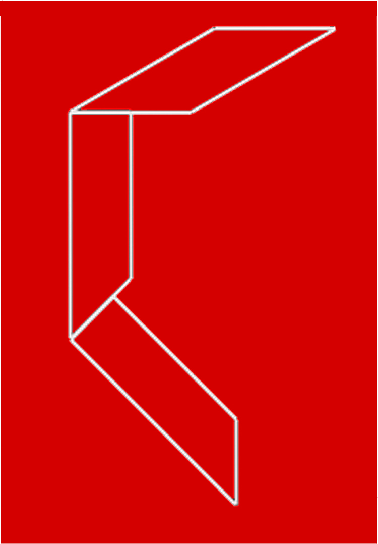
Describing the illusion that way may explain a puzzling variant of Shepard’s Tables, recently reported by Lydia Maniatis, as mentioned in the previous post. As the problem appears in these nested tables, at B the edges of the table-tops that are horizontal on the screen must be receding into depth, and yet they don’t show the dramatic illusion of a stretch into depth that we see in the edges receding into distance at A. Why not?

Isn’t it a question of perspective? At A the horizontal table edges are represented as if seen head on, parallel to the image plane – the plane at right angles to our line of sight. The table edges that are oblique on the screen at A must therefore be extending into depth in the most extreme way, parallel to the line of sight and at right angles to the image plane. Seen like that, depth effects are maximised. At B, no edges are aligned with the image plane, and all the edges, even the ones that are horizontal on the screen, are receding at 45 degrees to the line of sight. That’s a much less extreme recession into depth. So although the table edges that are objectively horizontal on the screen at B are receding, they don’t show as much illusory stretch into depth as the receding edges in A. 

Lydia Maniatis observation raises a general point that’s really interesting – the way that appearances can depend on what we mean by “up”.

Continue reading

Shepard’s Tables – what’s up?

This is an animation of Shepard’s Tables, an illusion first published by Roger Shepard as Turning the Tables, (see his wonderful book Mind Sights, 1990, pages 48 and 127-8). The left hand lozenge-shaped table top seems to get longer and thinner as it rotates, but it’s an illusion. It remains identical to the right hand table-top, except for rotation. The table-tops look even more different as the legs appear. The illusion is an example of size-constancy expansion – the illusory expansion of space with apparent distance. The receding edges of the tables are seen as if stretched into depth. Earlier posts on size-constancy showed how objects can appear wider with distance. That shows up with Shepard’s tables too, in the way that the oblique edges of the tables seem to get a bit wider apart with distance. The stretch into depth is more striking.

Recently Lydia Maniatis pointed out a puzzling aspect of the illusion, in her prize-winning entry for the Illusion of the Year Competition. Here’s a version of her figure.

Lydia Maniatis's Shepard's Tables puzzle

All three table tops are identical, but the middle one looks different from the one on the left, though it’s not even rotated. Instead the vertical axis of the figure is shown at an angle to gravitational vertical. That means that the blue edges are no longer aligned with the frontal plane of the image, as to the left, even though they are horizontal on the page, but must be receding into distance. And yet we don’t see the dramatic stretch into depth that appears with oblique edges that recede into distance. Why not?  Try looking at the middle block with your head leaning over to the left, so that the short edges are aligned with your head, and therefore with the vertical axis of your field of view.  Now (for me) the blue edges do stretch into depth, though not as much as in the right hand image viewed normally.

What do you think is going on?  I’ll take a shot at an explanation in a post in a couple of days.

Big Ben leaning over!

Big Ben

Does Big Ben look like it’s leaning over more in the right hand image than in the left hand one?  It can take a double-take to spot that the two pictures are identical. I find it a fantastically strong illusion.

It’s a demo of a new illusion found by Frederick Kingdom and colleagues (you’ll need to scroll down that link to get to their bit – look out for an even more than usual Leaning Tower of Pisa). Their discovery is a new version of the size-constancy illusion. This is my second demonstration of it – a few posts back I used a picture of a historic streetlamp. But here’s an example that looks stronger to me, with a better known subject.

Update 10 Oct 2011.  Big Ben really is leaning over! But not (yet) as much as it appears to lean in this illusion.

Bressanelli and Massironi’s new illusion


Here’s another illusion only recently reported, by Daniella Bresanelli and Manfredo Massironi of the Universities of Padua and Verona.  Look at the three shapes, and most people seem to see the bottom one as thinnest, judging width at right angles to the long edges, the middle one as a bit fatter, and the top one as widest of all (still judging width at right angles to the long edges).  In fact, they’re all the same width, and the two bottom shapes are also identical, just rotated in relation to one another.

What’s going on?  If you devour technical articles like snacks, see Bressanelli and Massironi’s paper.  Otherwise …


Continue reading

Lamp falling over!

Only joking, but the right hand picture does seem to show this old lamp near me leaning over more than it does in the left hand picture.  But now check out the two pictures.  They’re identical!  It’s an illusion only recently reported by Frederick Kingdom and colleagues in McGill University (scroll down that link for their bit).  It’s yet another demonstration of the strength of the size-constancy effect.  (See my earlier posts on the wonky window and paradoxical size-constancy).  What’s remarkable about the McGill report is that it shows size-constancy coming into play even across the gap between two clearly separate pictures. I guess it means that at an early stage in trying to make sense of the visual scene, the brain just accepts the consistent depth cues in the two pictures as signalling that they are both part of one spatial scheme.

As Kingdom and colleagues demonstrated, the effect also works horizontally.  Here’s a demo:

This time the platform looks pretty much the same in the two pictures (as it is – the pictures are of course once again identical). But rails to the right, seen at a more oblique angle, seem to point a bit more towards vertical in the right hand image than in the left hand one.

Paradoxical Size Constancy

Size constancy is the term for our tendency to see distant objects as larger than they are. So the far end of a shape with parallel sides looks wider than the near end. (See the earlier post on The Wonky Window). It seems to be such a basic feature of vision that it can give rise to amazing effects.  In the photo, first note note that the “sculpture” is impossible! All four blocks are receding from us, so they could only connect up in real space as a bendy snake. Instead they join up in an impossible, ever-receding, endless loop.  (See the earlier post on M.C.Escher’s Waterfall for how that kind of impossible figure works). Here the endless loop leads to a paradox, thanks to size constancy. The distant end of each block seems wider than the near end, and yet at the same time seems to be exactly the same size as the apparently smaller, near end of the next block. Measure the sides of the blocks and you’ll find them parallel. It’s one of many demonstrations that perceptual space is not always geometrically consistent, (or it can be non-Euclidean, as the specialists put it).


I located my impossible sculpture in a deeply receding space because that makes the effect just a bit stronger.

Update January 2010: How could I have overlooked this?  The stripes I’ve added to these blocks will be enhancing the effect of divergence by adding the chevron illusion to the size-constancy effect.  The chevron illusion was first reported 500 years ago, by French writer Montaigne, as related in Jaques Ninio’s book on illusions, page 15.  The chevron effect is a special case of the illusion later re-discovered a bit over a century ago as the Zollner illusion.  Some specialists would say both effects depend on the brain’s attempts to make sense of figures as shapes in space.  I suspect that’s true of the size-constancy effect, but that the chevron effect is 2D, pattern driven.  That seems supported by the observation that whilst in the picture above the chevron and size-constancy effects are acting in consort, they can also oppose one another, reducing the effect of divergence.

Read on for more on size-constancy.

Continue reading